35A
35A
PROJECT INFORMATION +
35A is a purpose-driven initiative started by a passionate duo of photography professionals.
Avid educators and community builders, they founded 35A to offer a Masterclass-esque educational course that connects leading lens-based artists and practitioners with emerging talent. Their aim: to share knowledge, shift perceptions, decolonise the space and engage their community towards social justice and positive change.
The identity brief was to create something clean, contemporary and ‘a bit clever’ that would be an expression of the founders’ creative partnership.
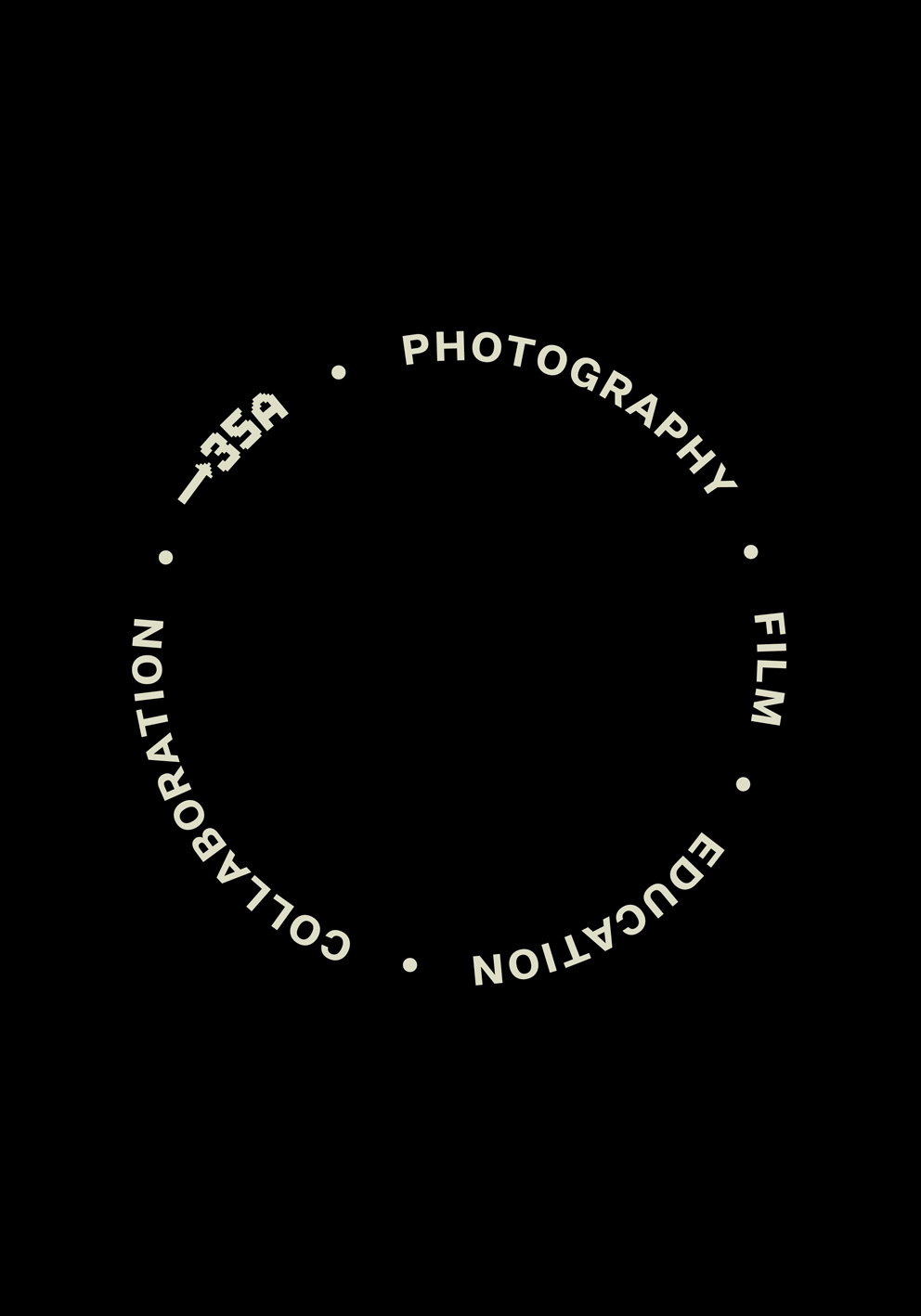
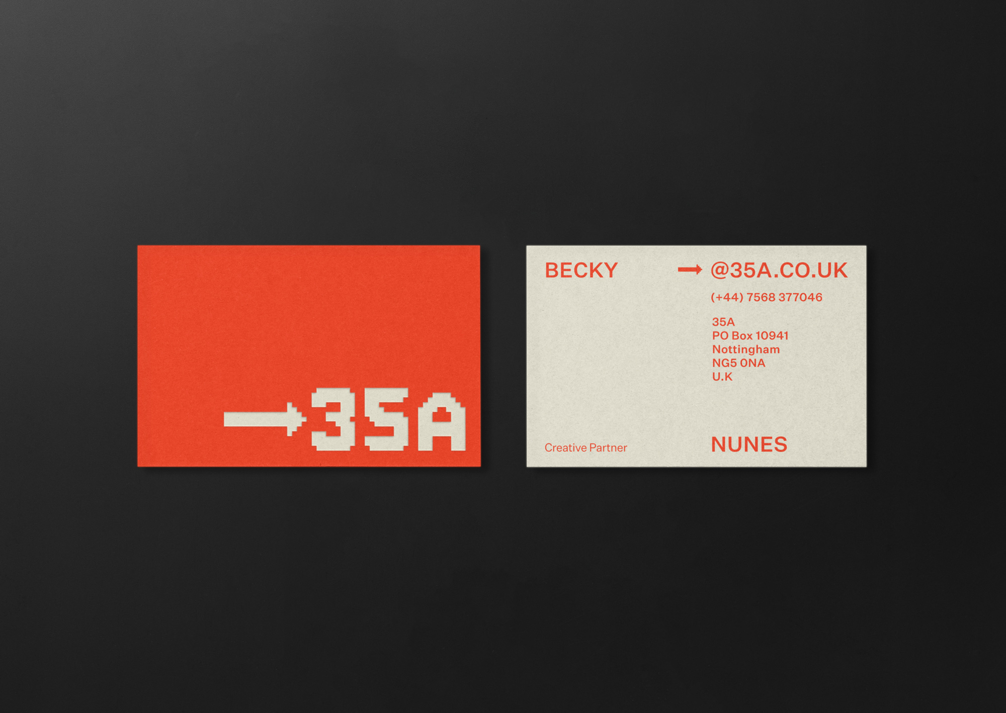
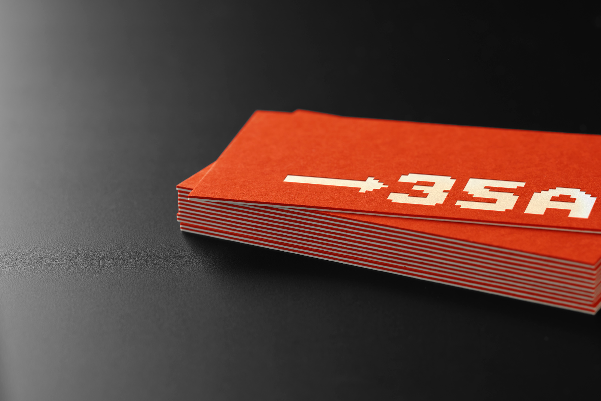
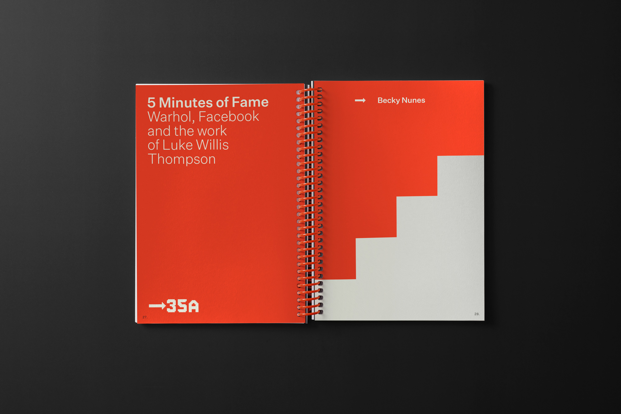
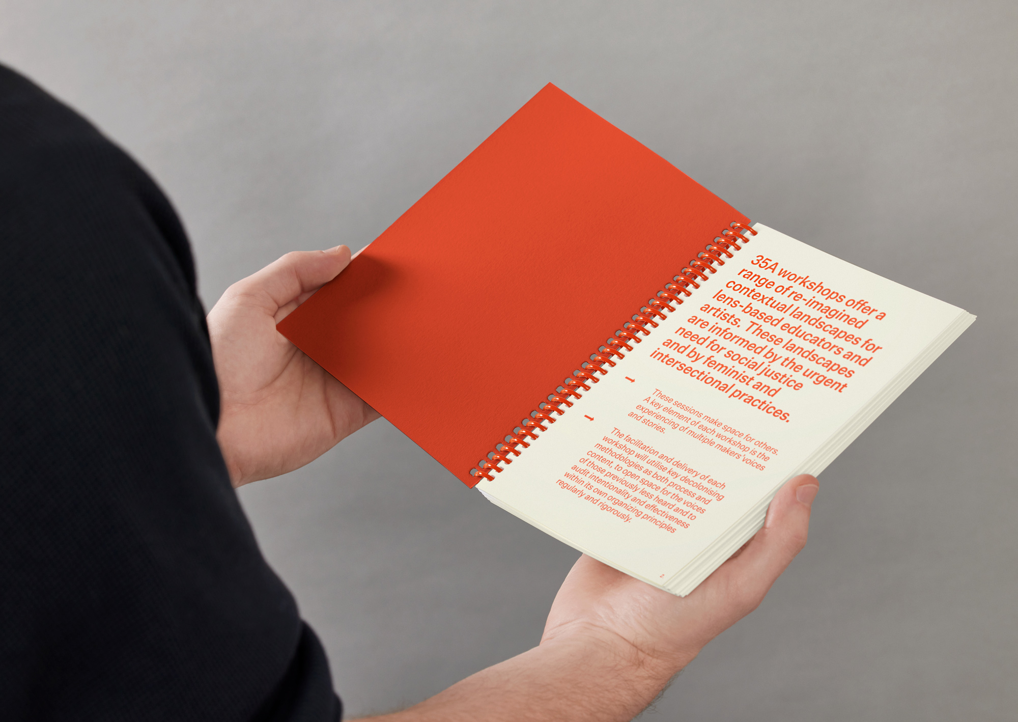
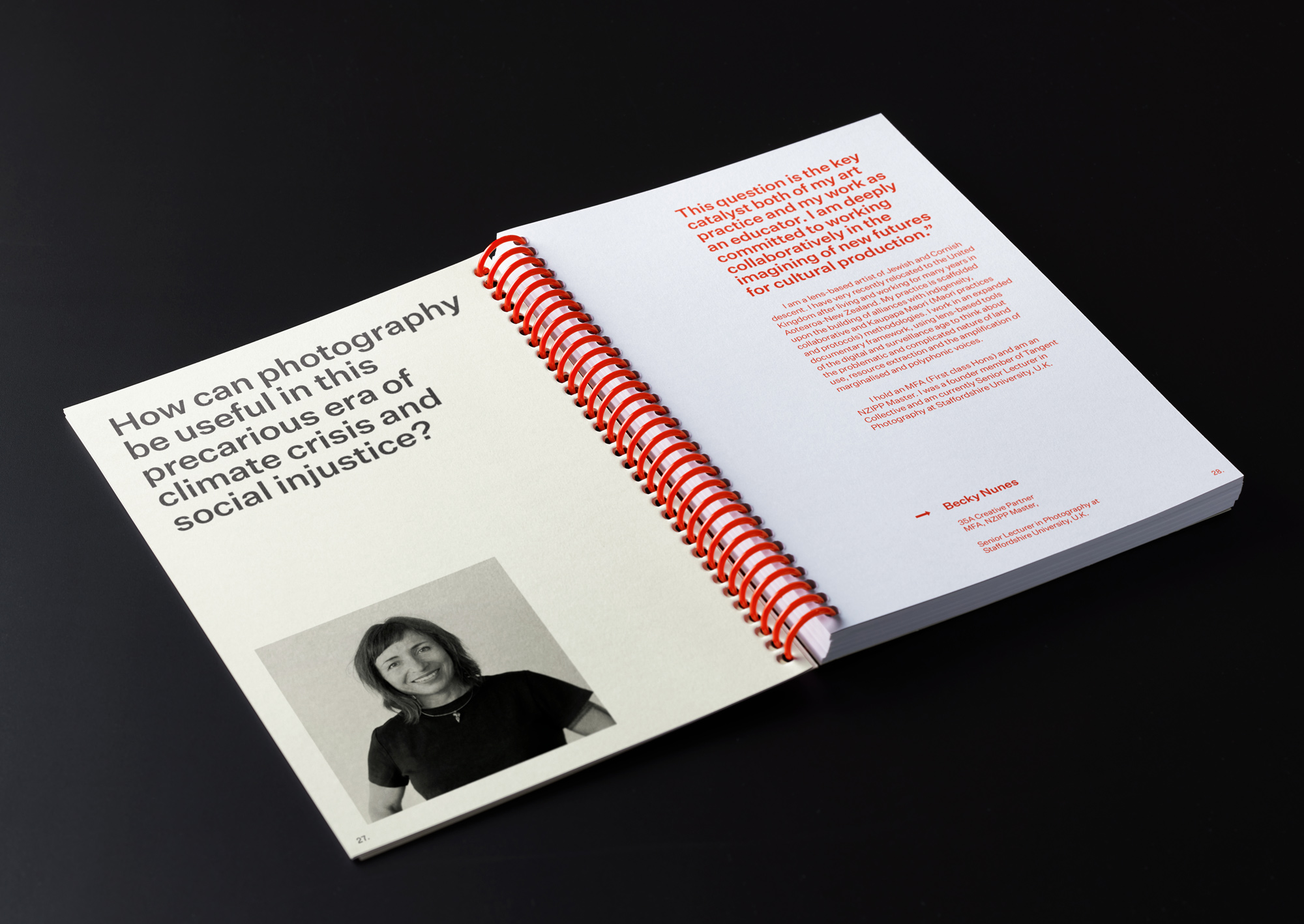
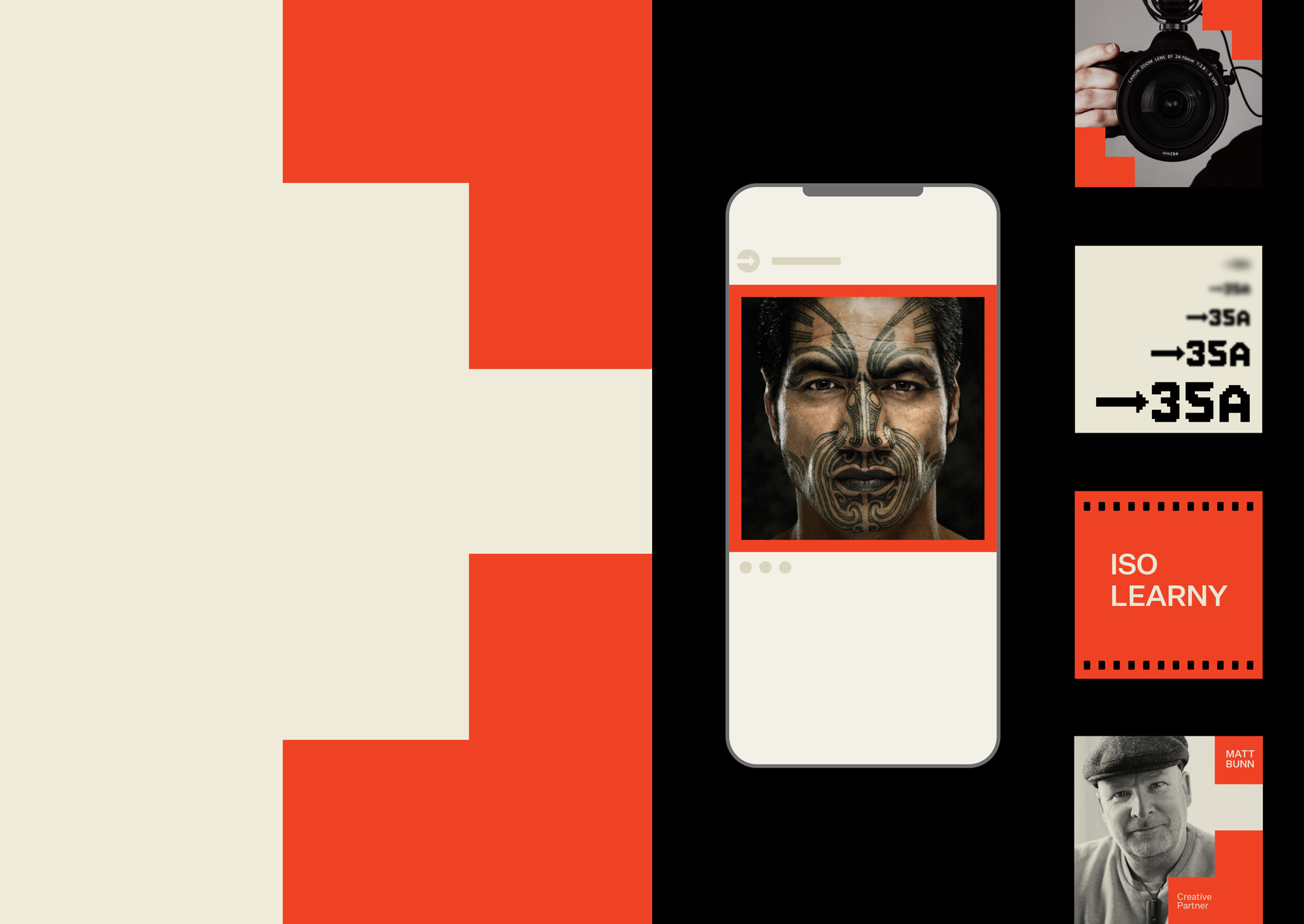
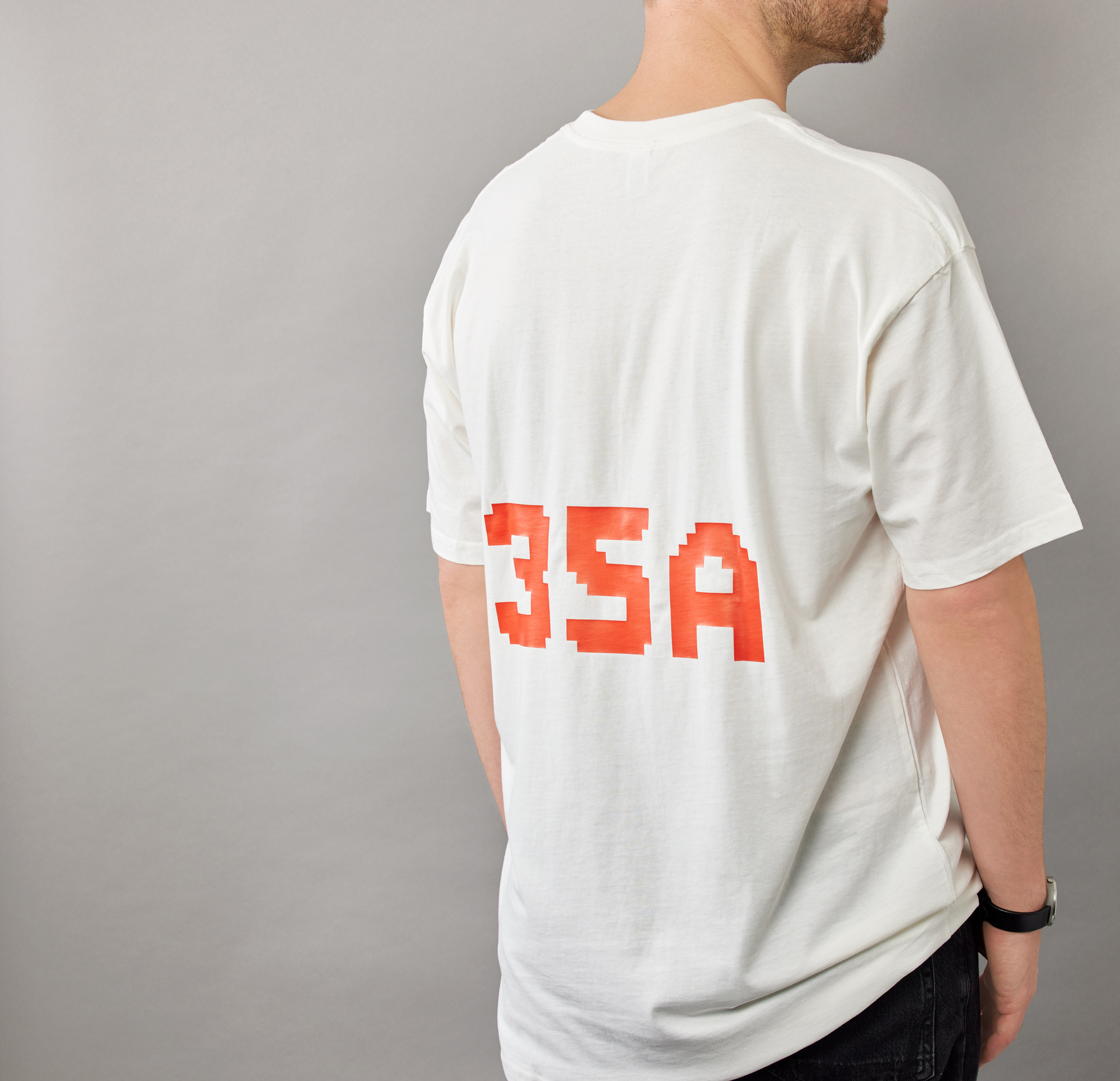
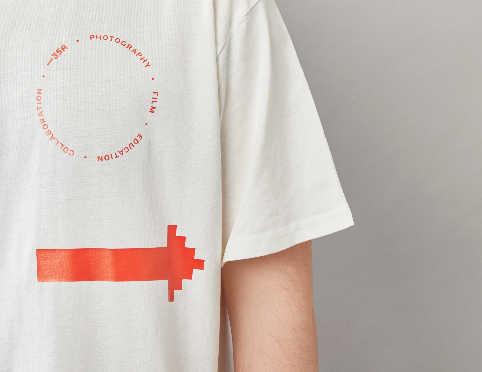
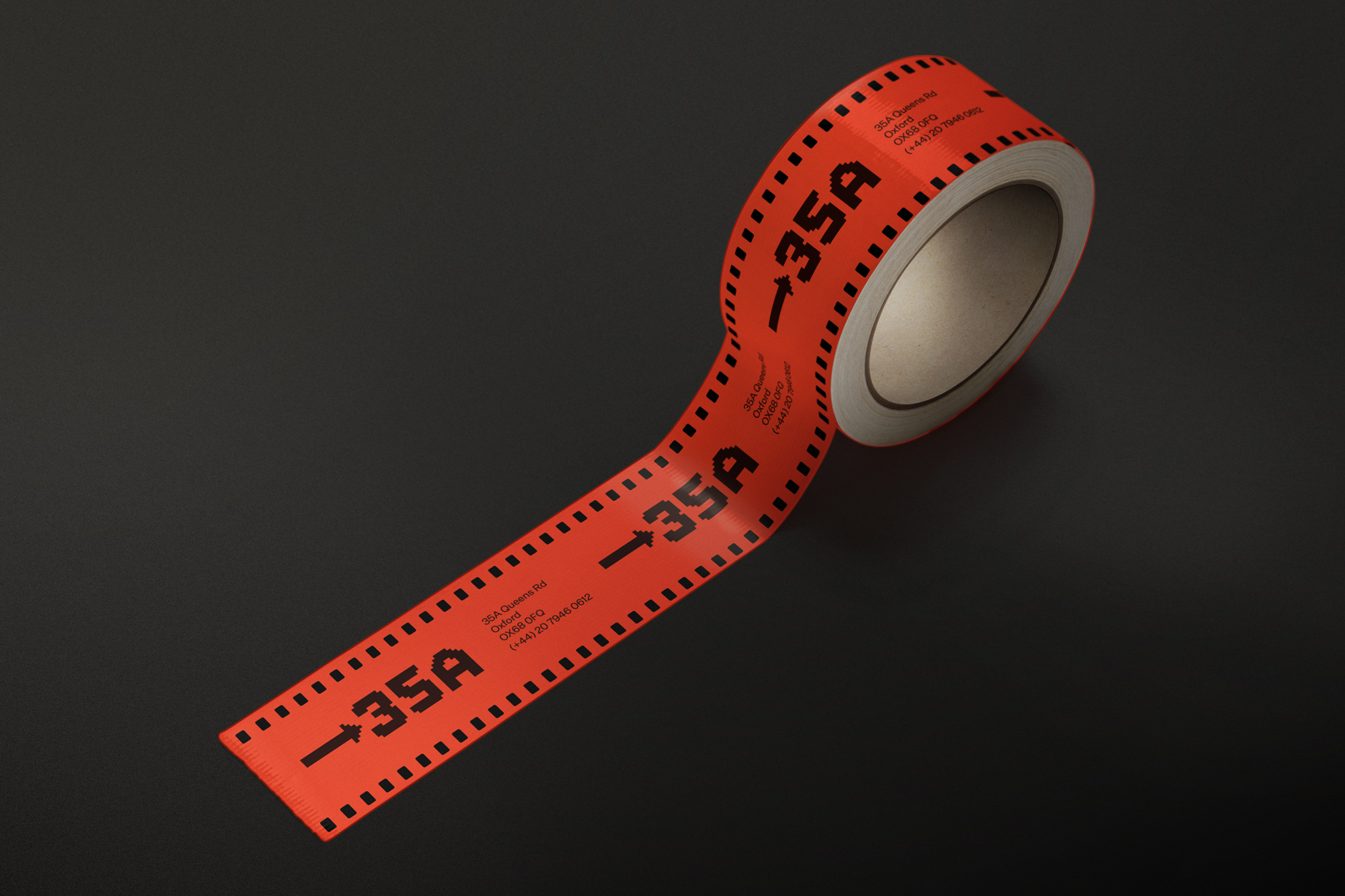
Strong photographic references imbue the brand, 35A being the penultimate frame of a 35mm film roll. The pixel based letterforms of the wordmark are inspired by film frame numbers. The bold orange colour offers a contemporary reference to the sepia colour of 35mm film. The rondel composition references lens specification markings. Copy callouts riff off photographic language with irreverence, contrasting the norm within an educational setting.
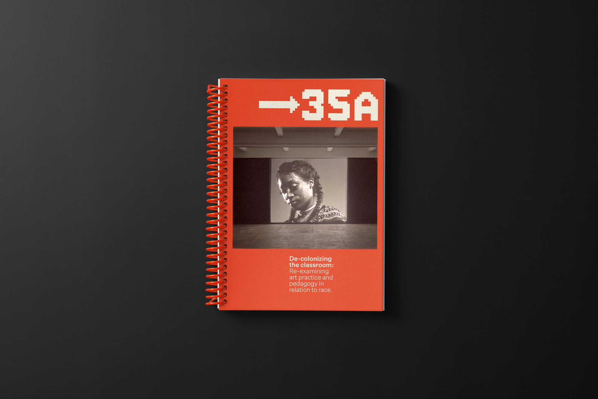
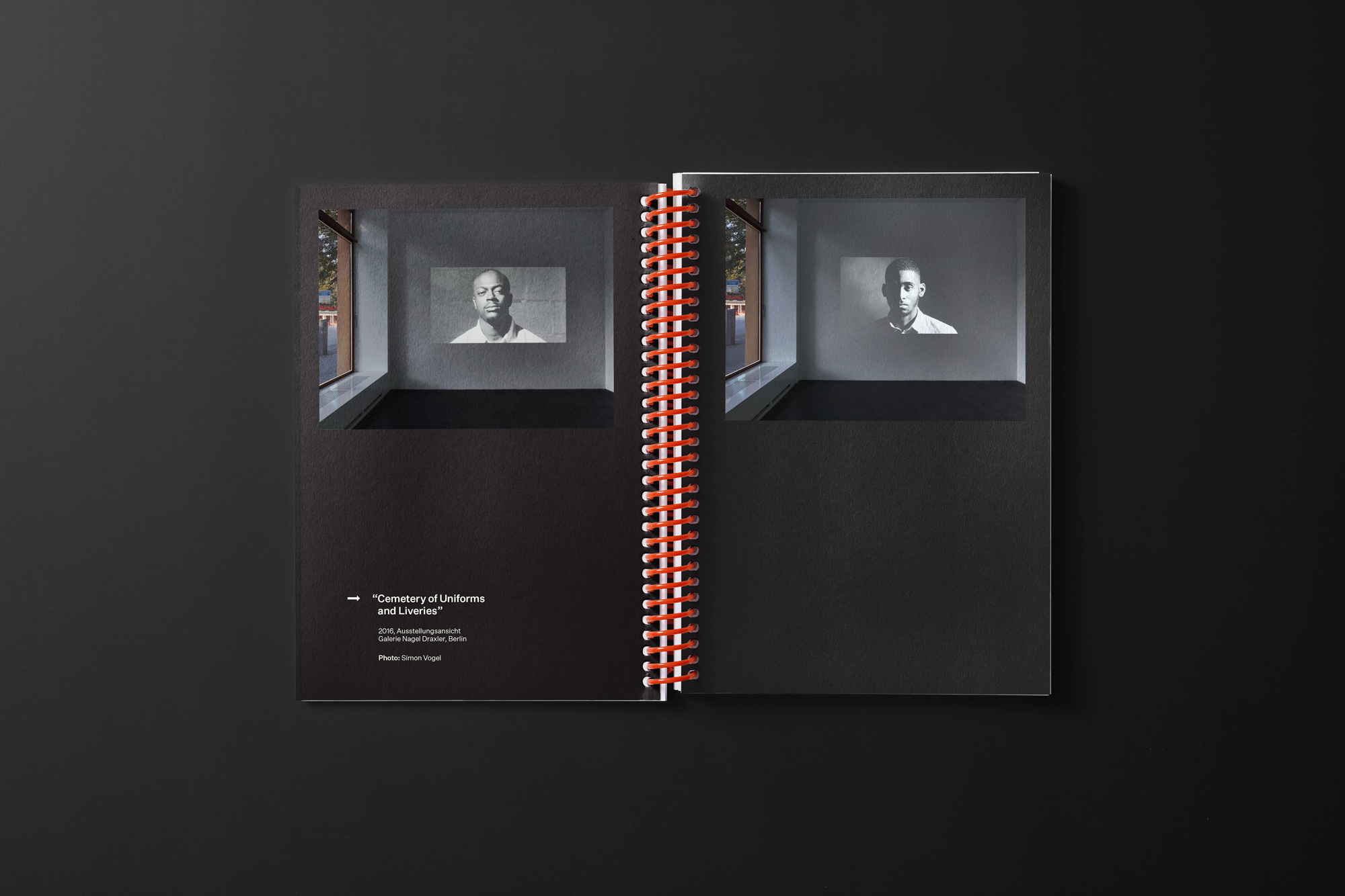
Overall the design retains a simple yet distinctive aesthetic that translates across key elements such as company collateral, emails, social, course and promotional materials.
Project
35A
Client
35A
Year
2020
What we did
- Brand Identity
- Design & Art Direction
