Edith Collier
Edith Collier
PROJECT INFORMATION +
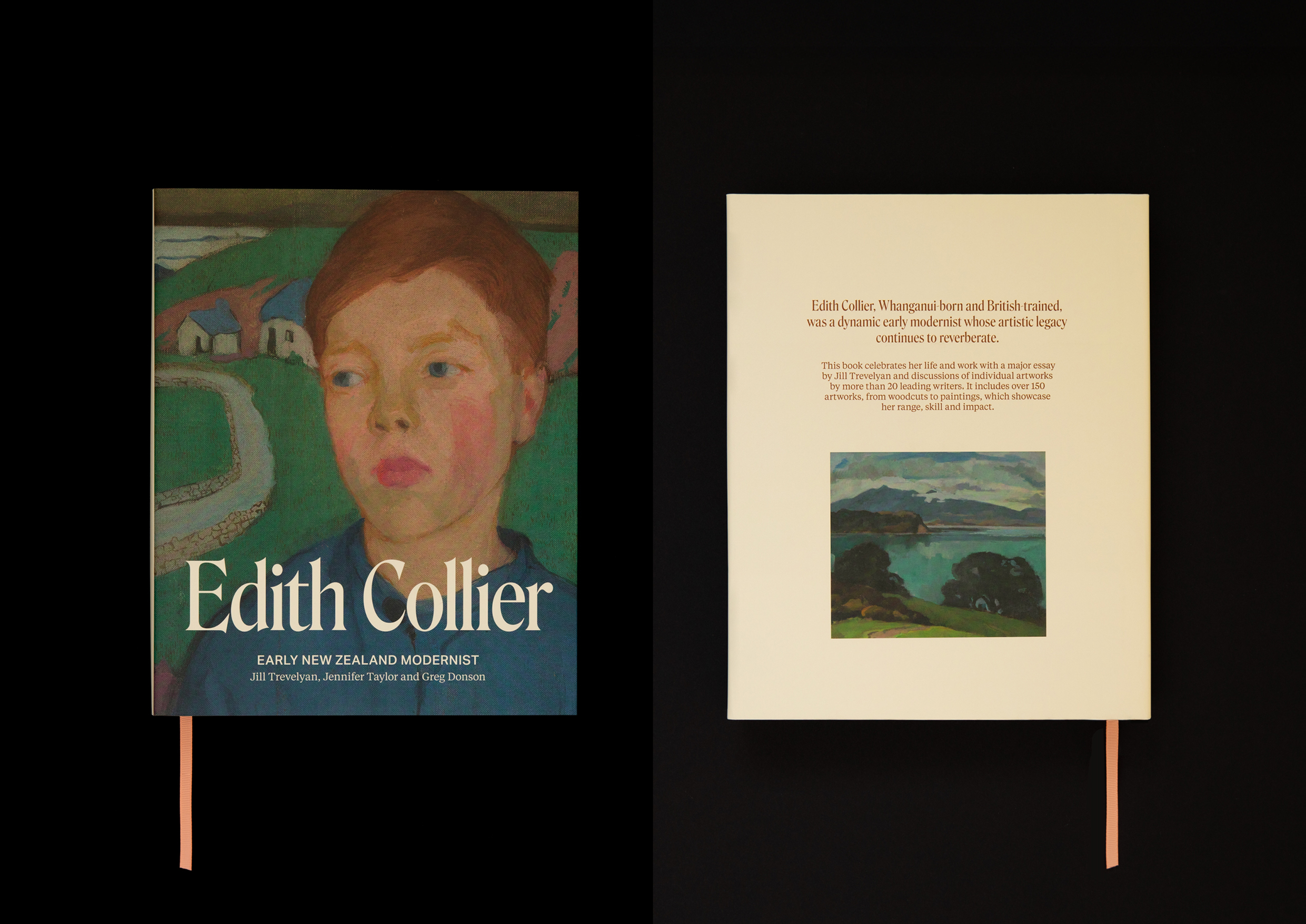
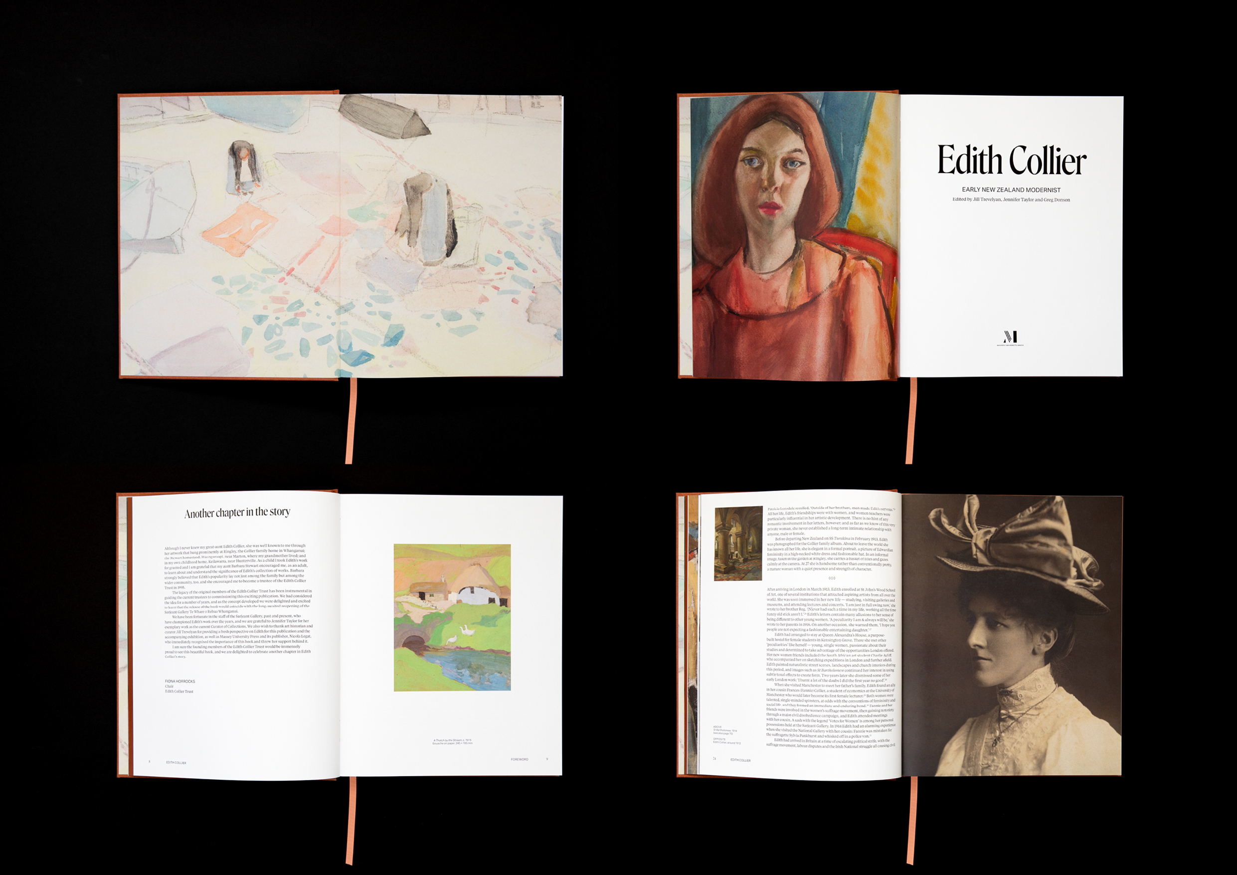
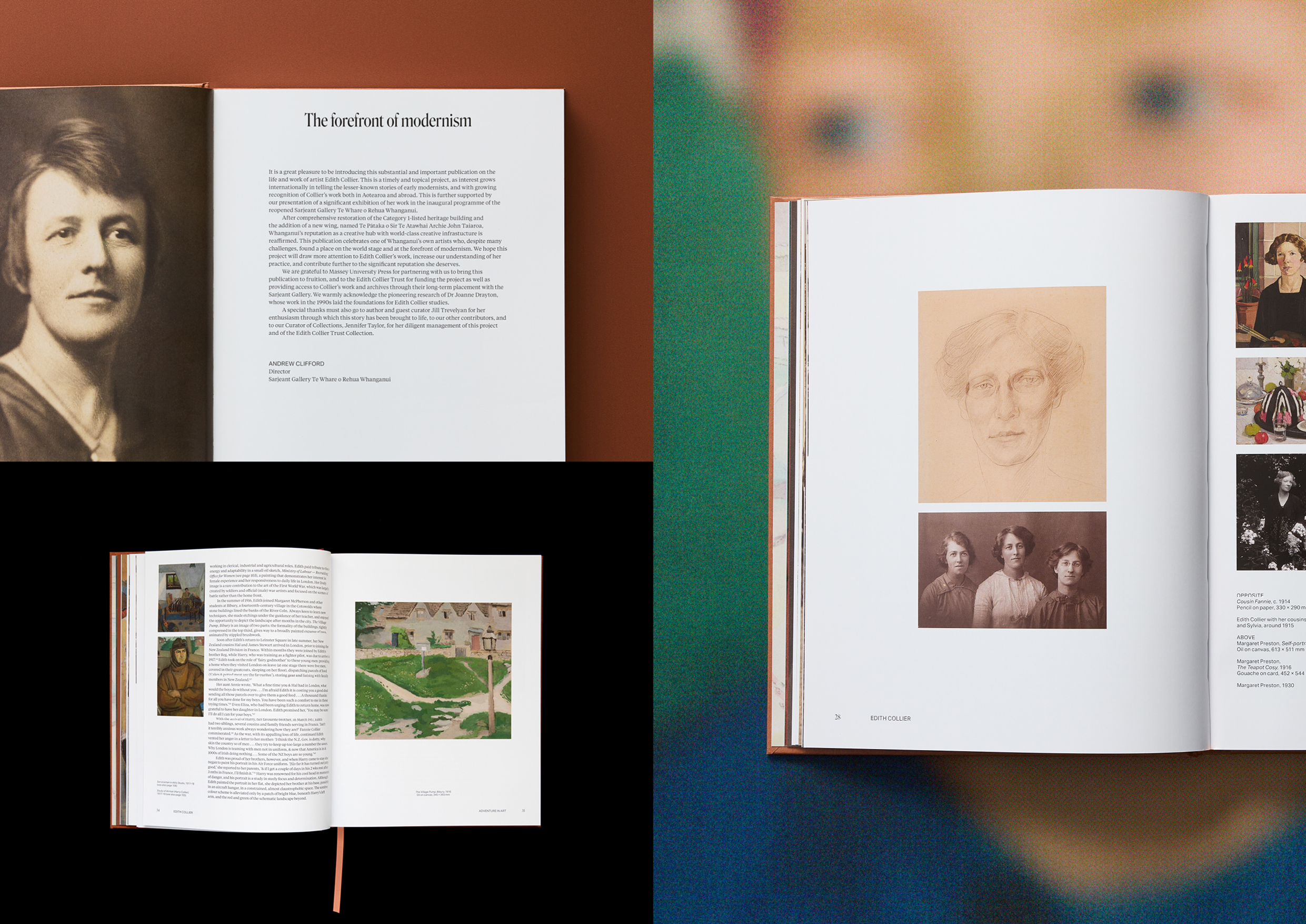
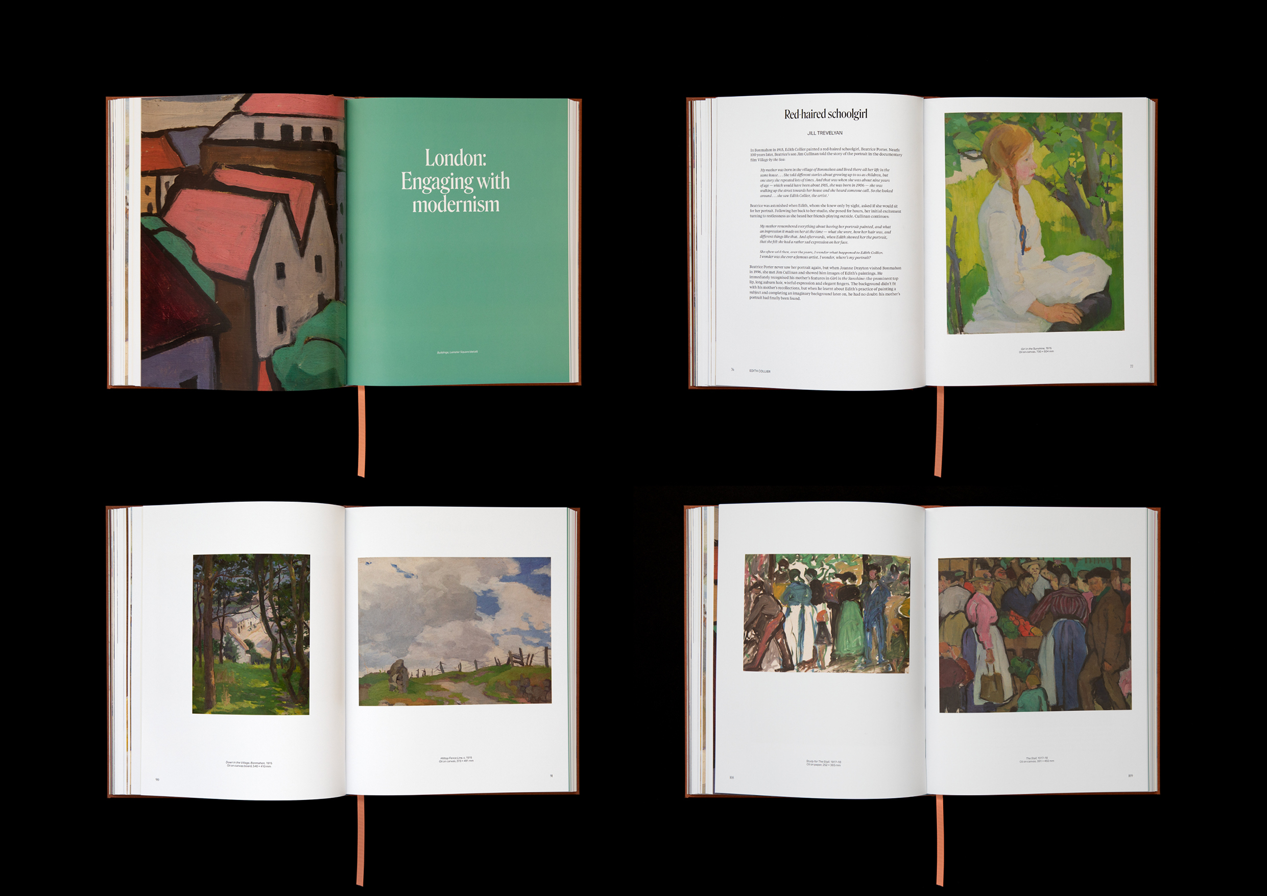
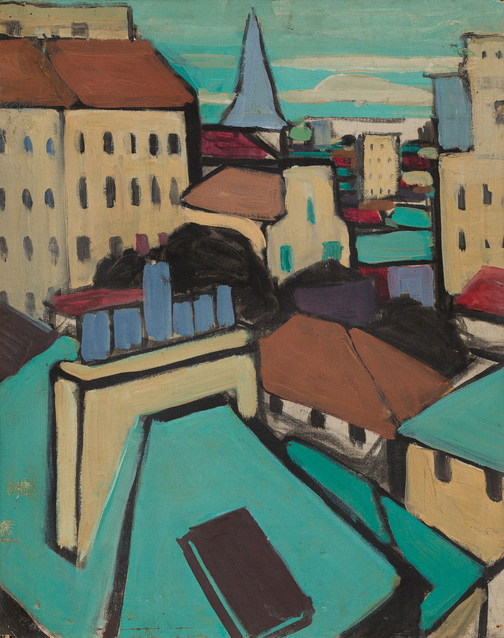
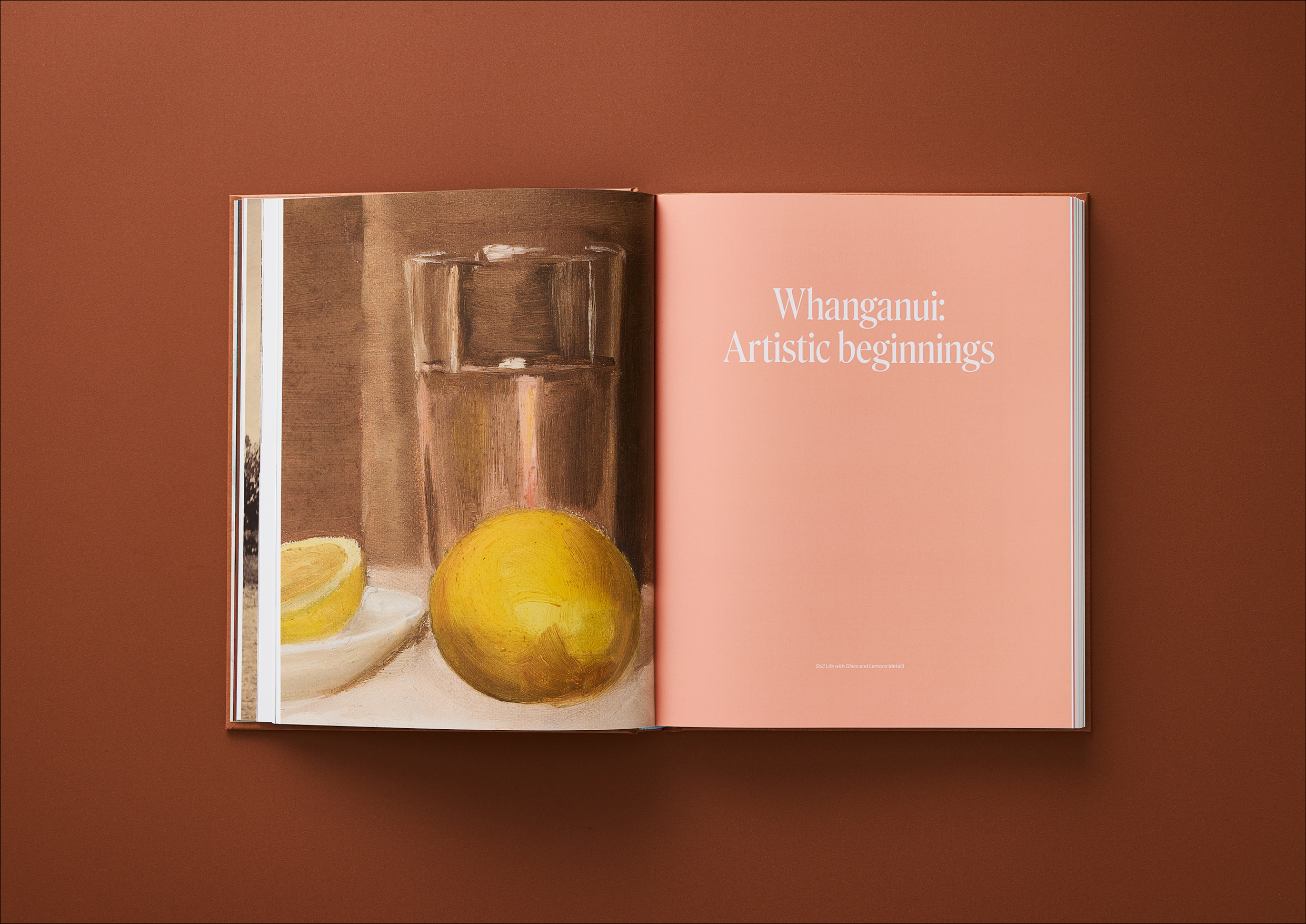
This project was created to honour New Zealand modernist artist Edith Collier, whose bold and progressive work was underappreciated in her time, particularly by her own family. The design brief was to produce a book that held the emotional and artistic tension between Collier’s creative ambition and the societal and familial constraints she faced. The goal was to craft a visual language that echoed this duality, combining traditional elements with contemporary expression, restraint with strength — much like Collier herself.
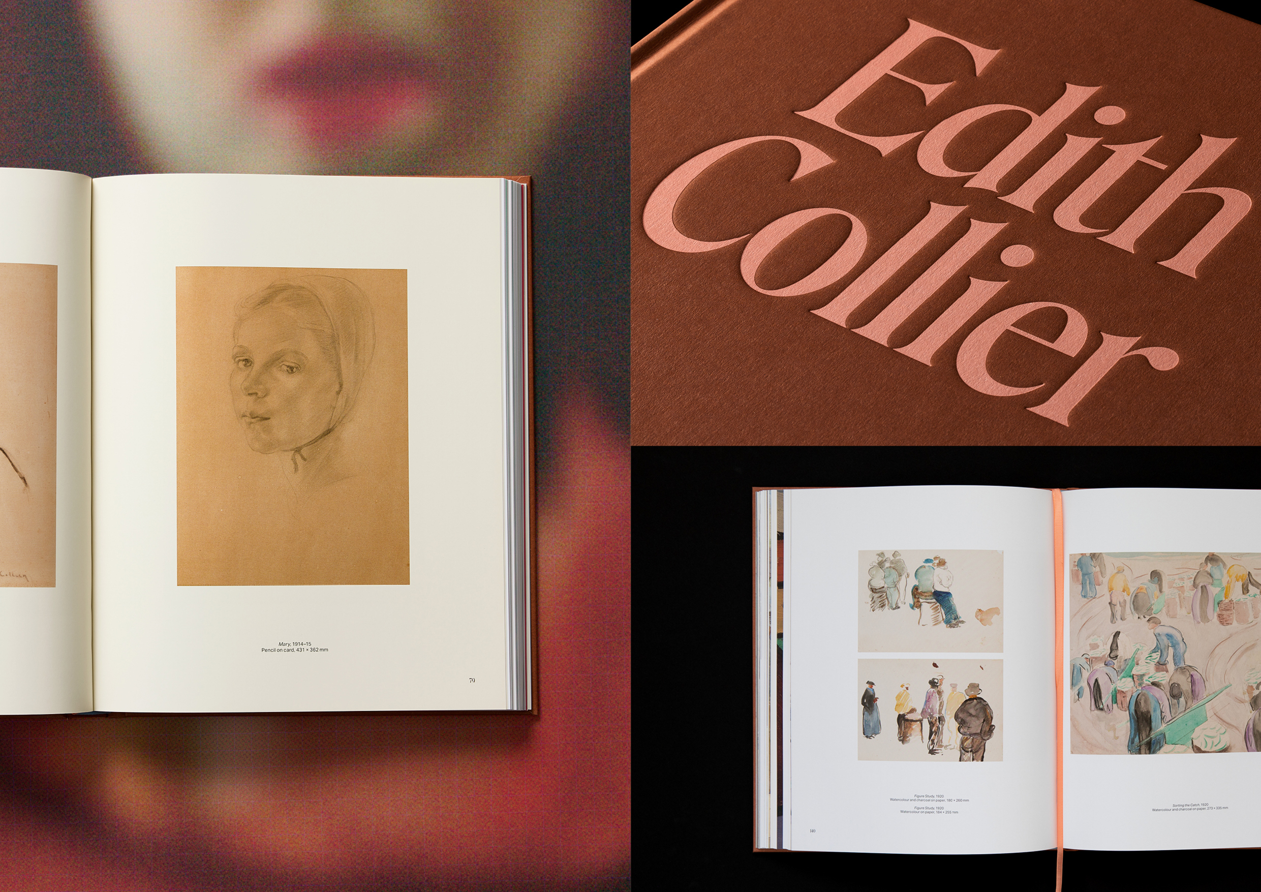
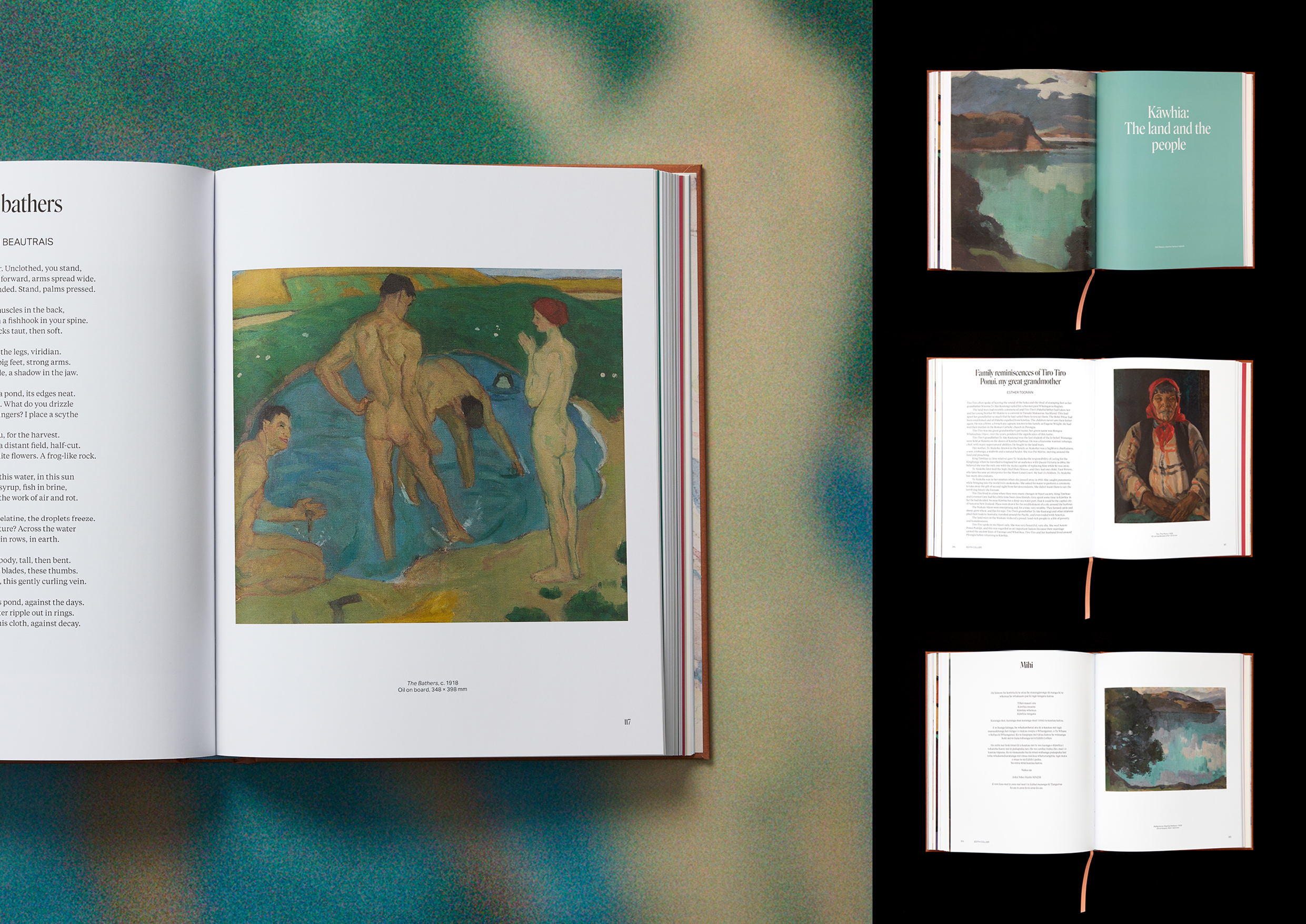
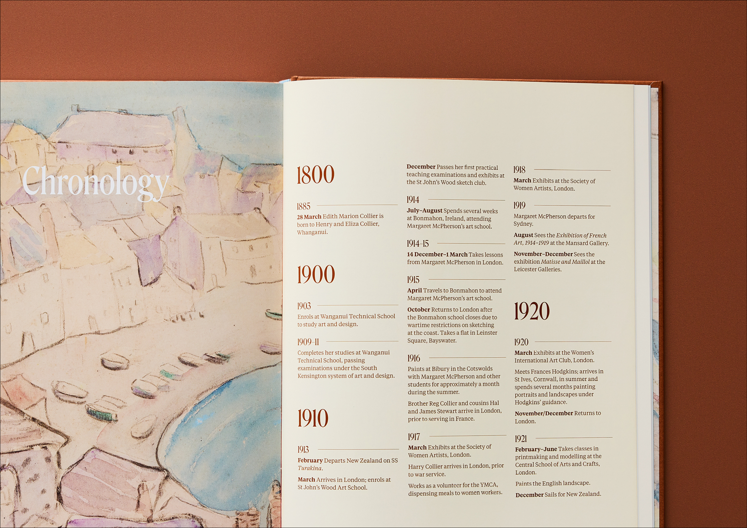
The final design successfully balances heritage and modernity. The expressive typeface Roslindale, inspired by a 19th-century style but sharpened with sculptural edges, reflects both Collier’s strength and femininity. The body text in Tiempos nods subtly to her New Zealand roots, while sans serif elements provide a modern rhythm. Layout choices, such as centrally placed, left-aligned text, evoke traditional print methods while challenging hierarchy.
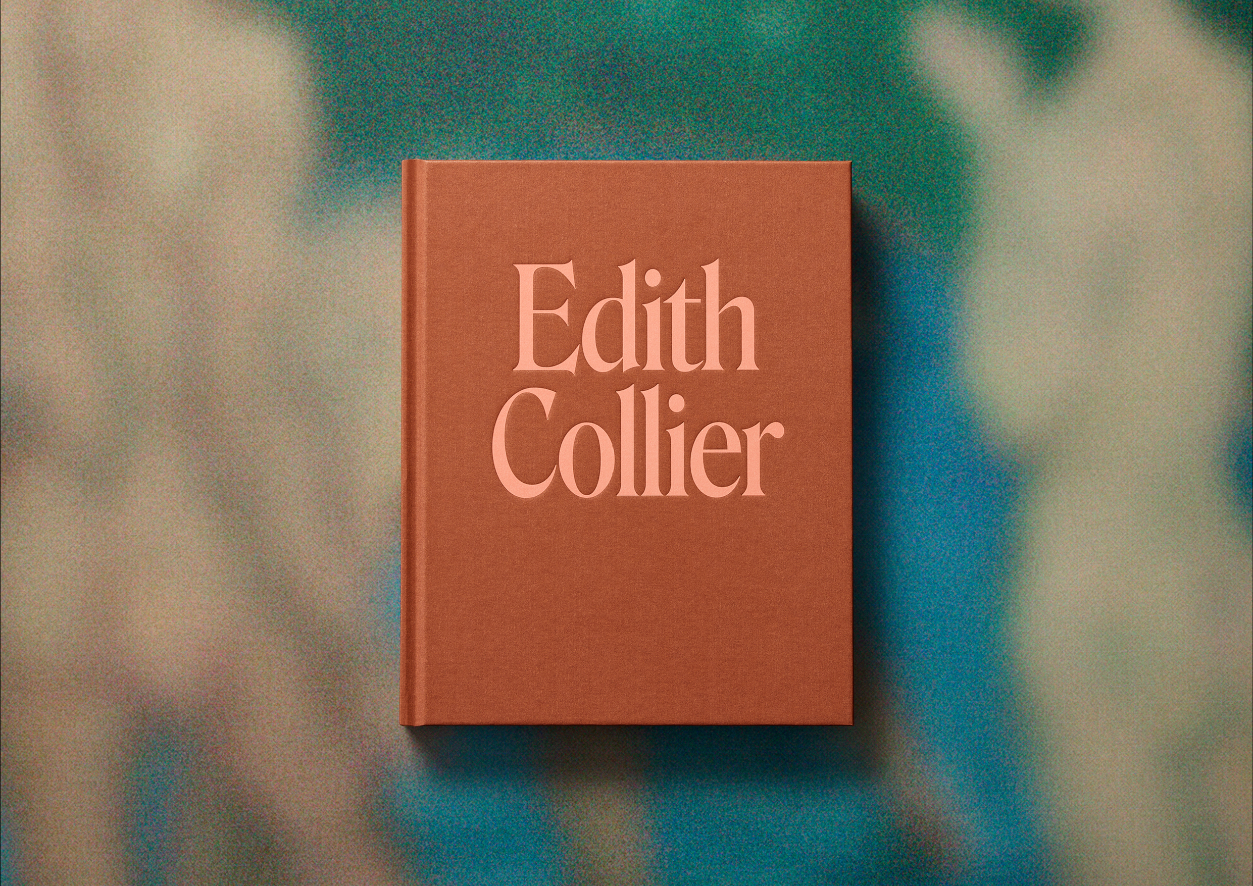
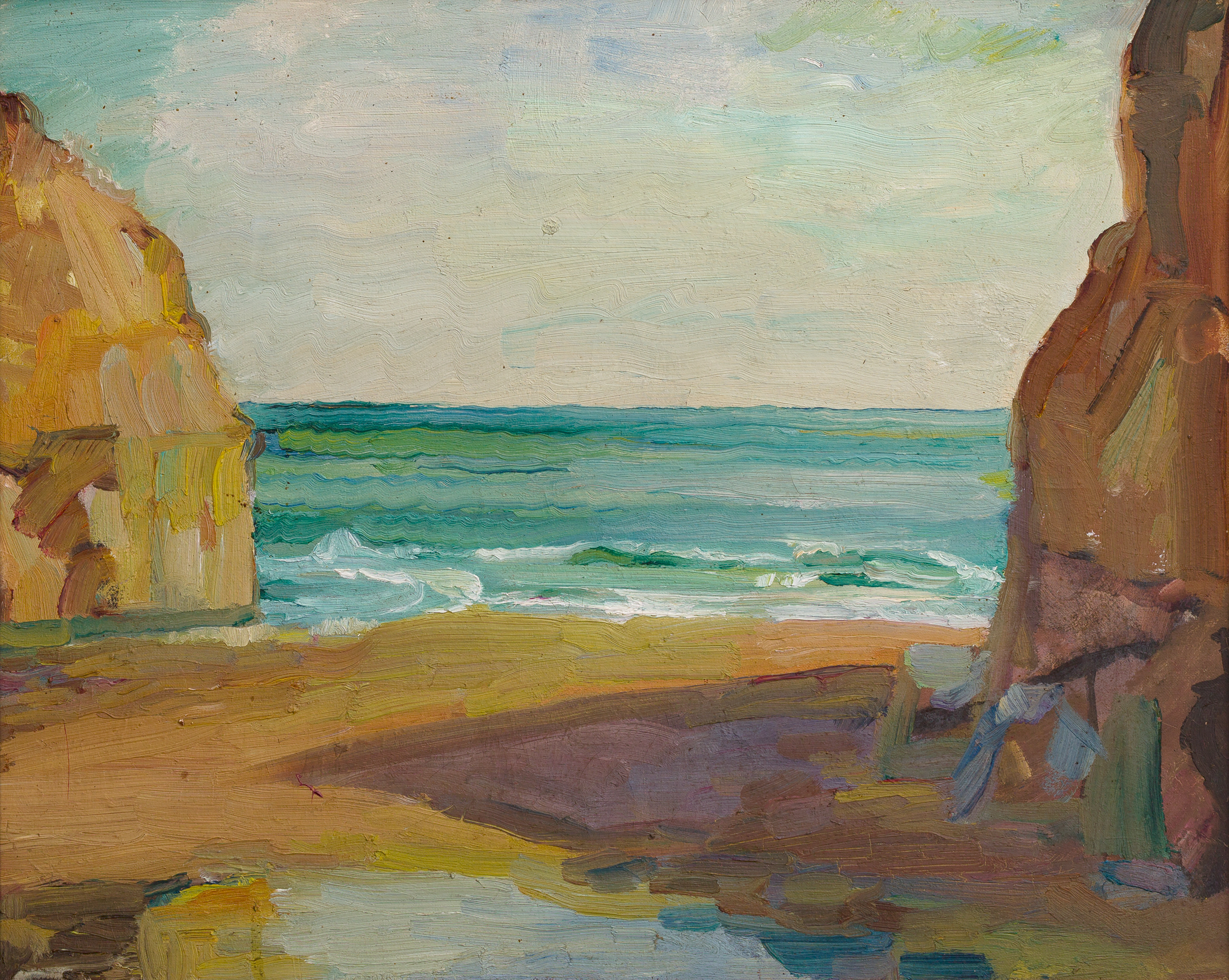
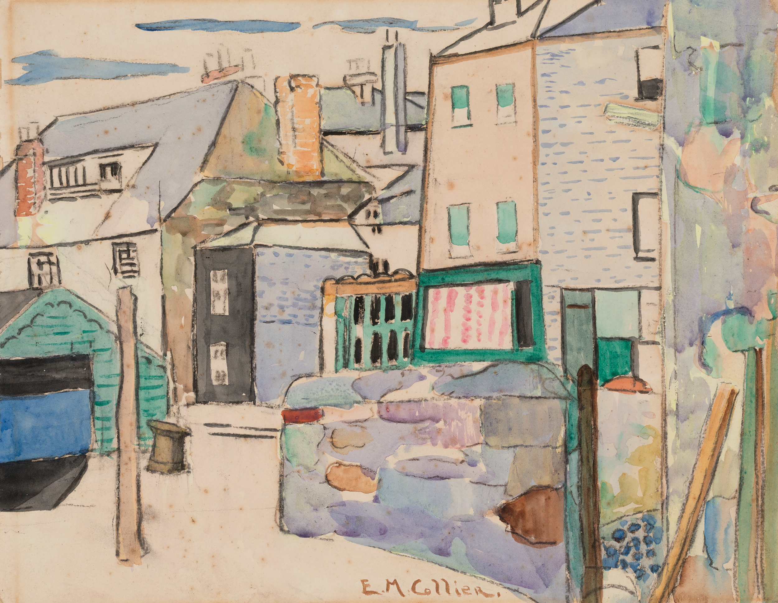
The book's cover is stark, singular, and bold, simply her name, foregrounding her legacy. A colour palette derived from her paintings further reinforces the personal connection. What sets this project apart is its ability to translate biography into design form, expressing the complexities of Collier’s life with clarity and subtlety. The result is a respectful, modern tribute that redefines the traditional art monograph.
Project
EDITH COLLIER
Client
MASSEY UNIVERSITY PRESS
Year
2025
What we did
- Editorial Content & Design
- Design & Art Direction