Hinterland
Beyond what is seen or known
PROJECT INFORMATION +
Hinterland provide specialised financial services for film makers. They are known for seeing beyond the surface level and drawing upon their deep experience to guide their clients through the intricacies of financial funding. With a highly creative audience, Hinterland wanted their identity to resonate with the sector in a unique way, whilst projecting confidence and professionalism.
Taking inspiration from Hinterland’s definition, 'an area beyond what is seen or known' we created a conceptual world where the brand lives in two forms; what is seen and known, and ‘the beyond’ – revealed through a window inspired by the 2.35:1 cinemascope ratio.
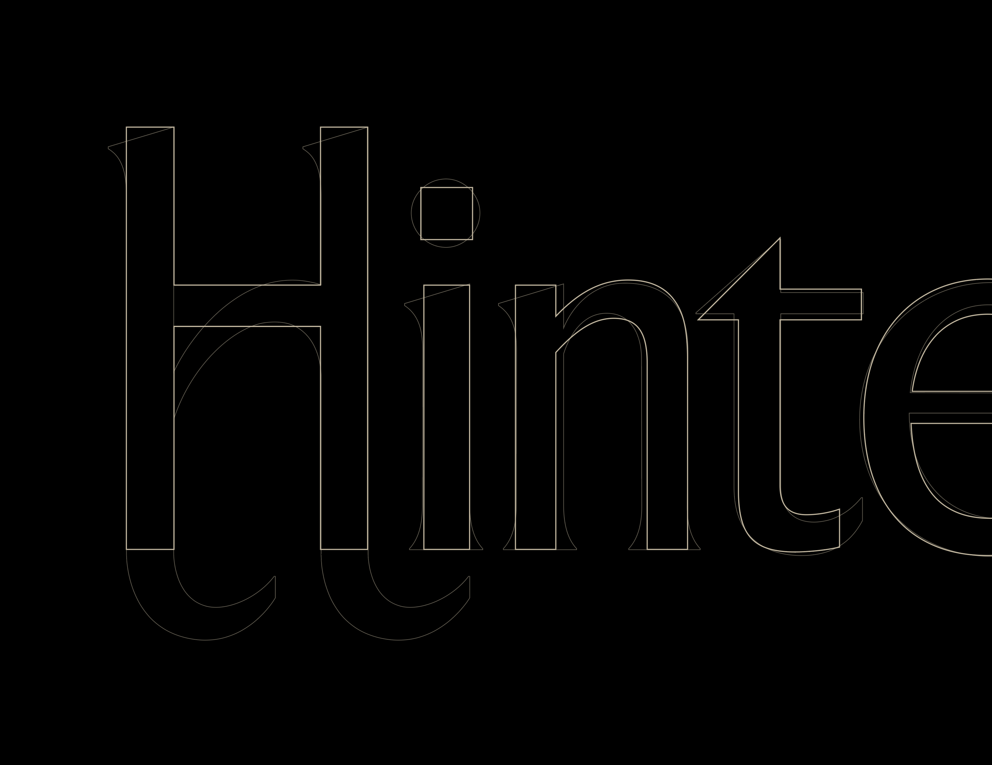
Two highly crafted wordmarks were created in juxtaposition; a functional sans serif on the surface level contrasts an unexpected characterful serif in the beyond. Referencing whimsical movie title cards, it also alludes to the horizon of a hinterland within the cross bar of the ‘H’.
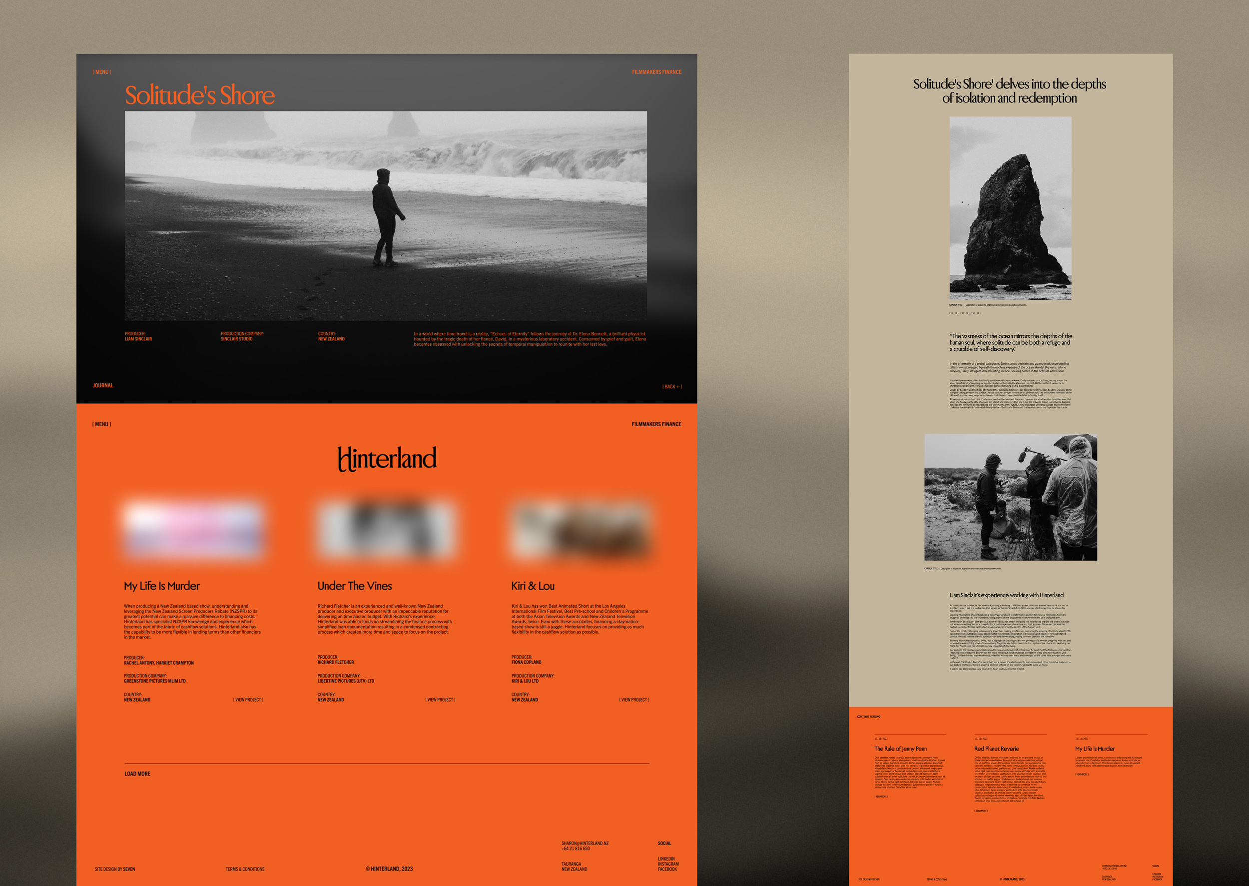
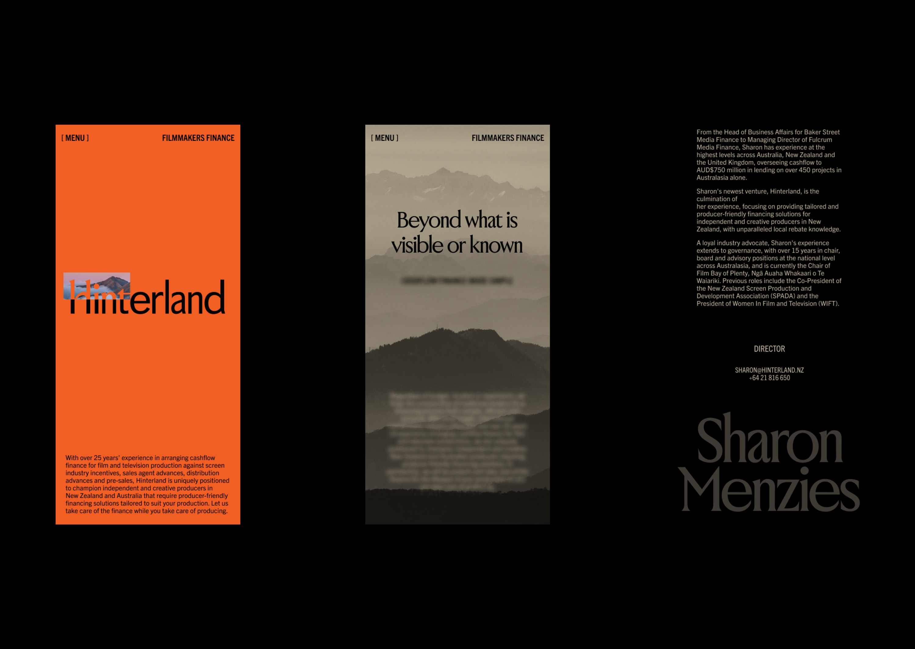
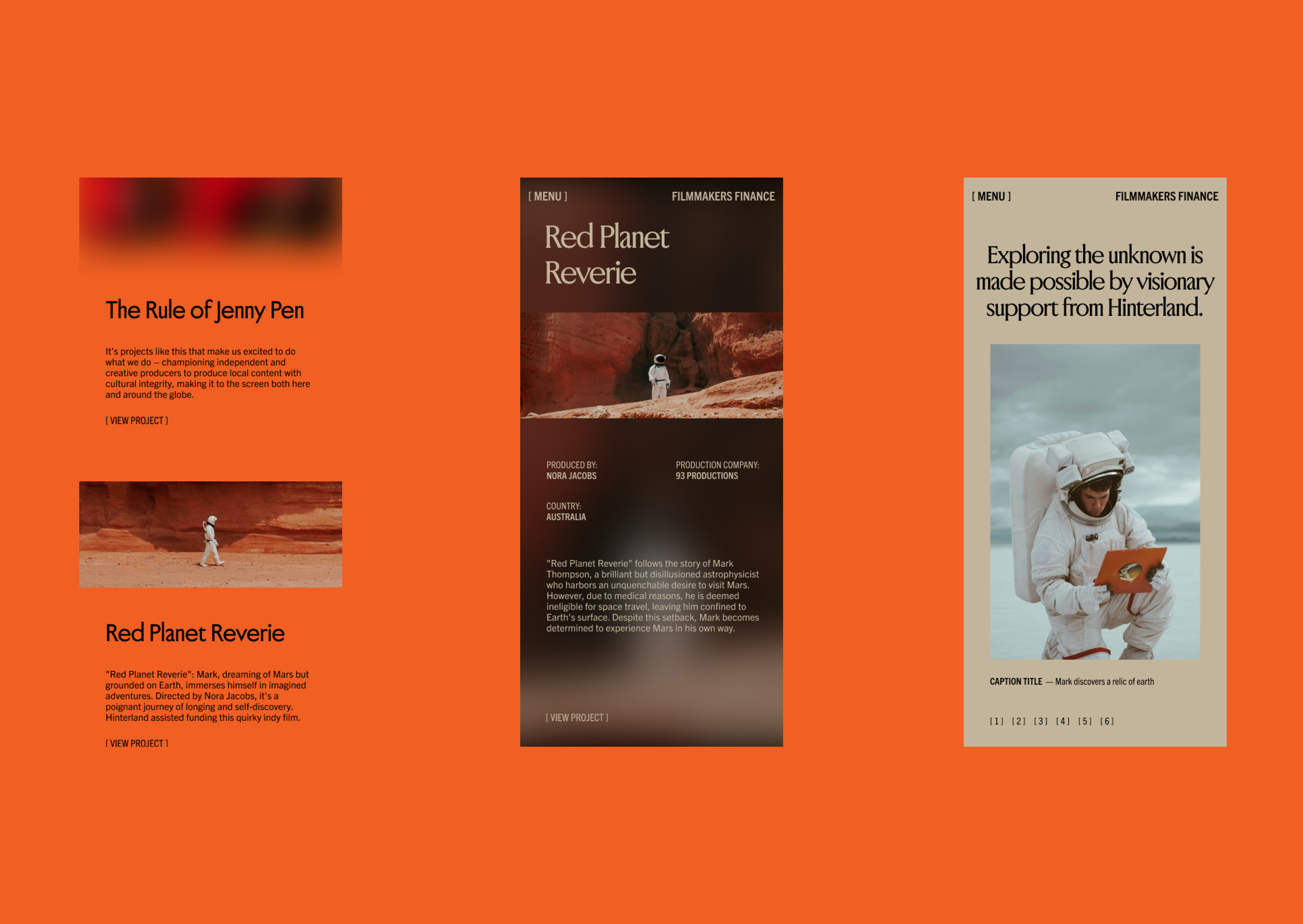
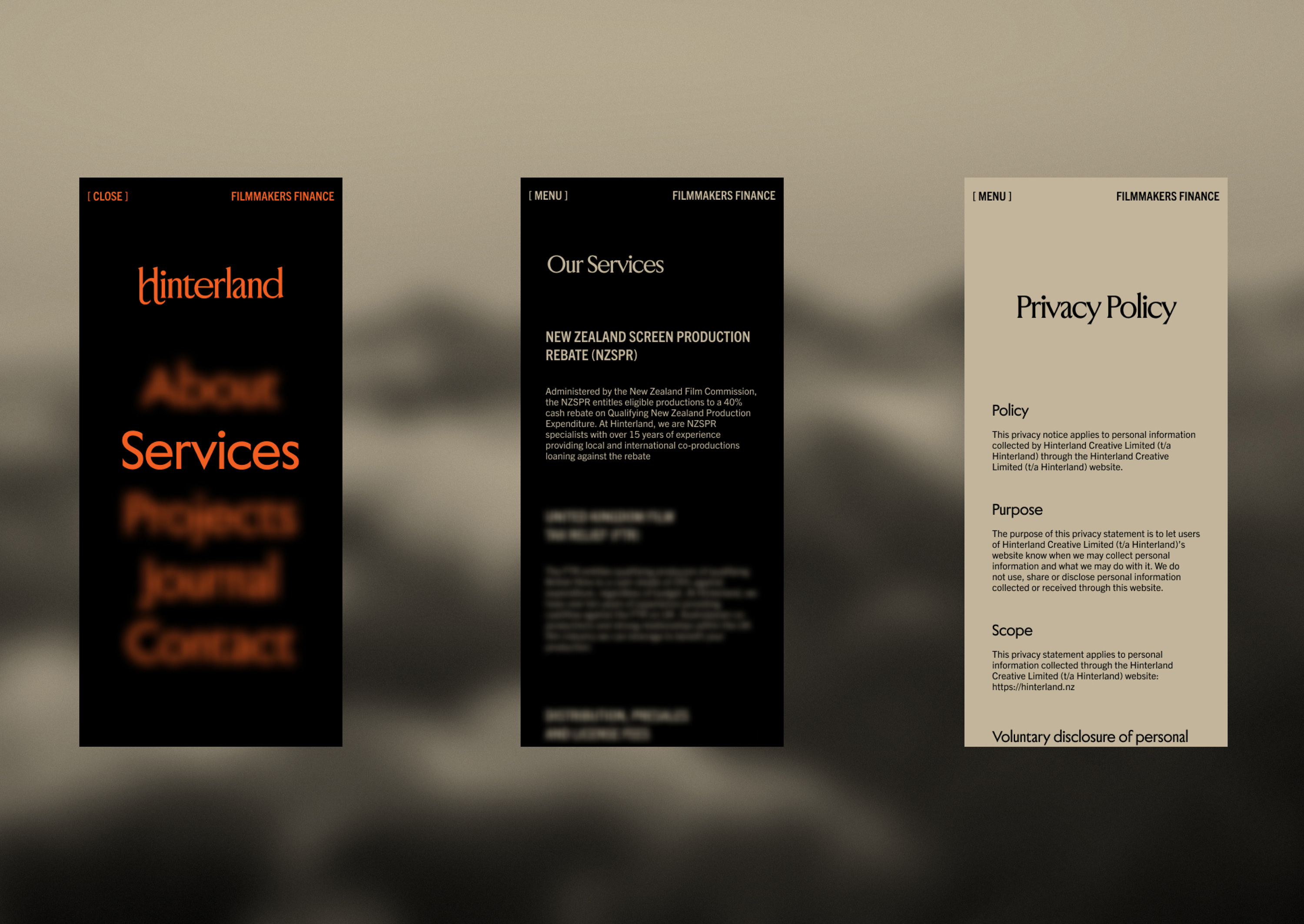
To express the brand’s unique perspective Hinterland’s website provides an unexpected experience, revealing a world beneath through a cursor tracking cinemascope window, and visual play on distance and camera focus, activated on scroll and rollovers.
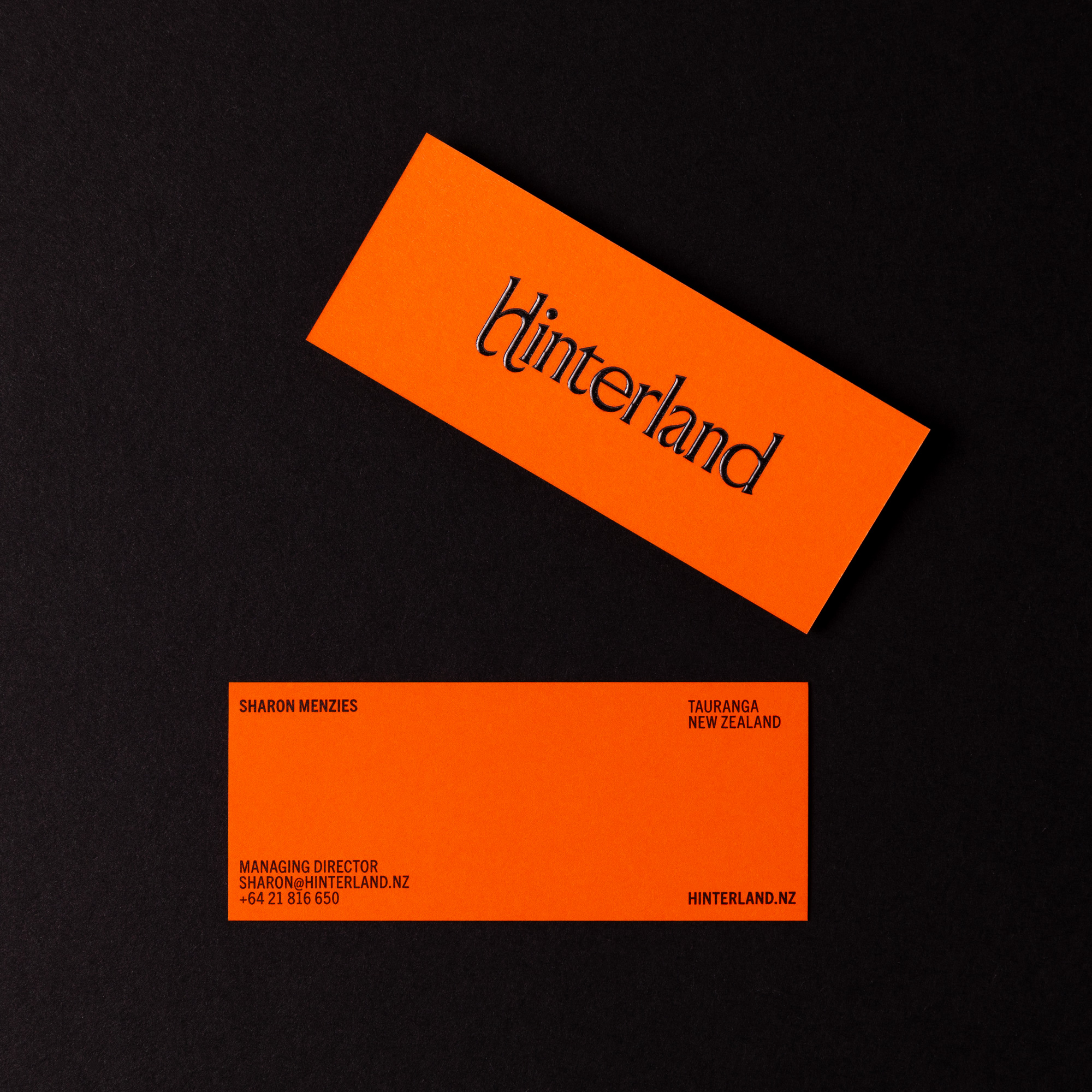
Hinterland wanted the business cards to make a unique statement that helped provide a bridge between the typically conservative finance sector and the creative world of film. Cinematic design cues informed the cards unique size and a vivid orange uncoated stock was selected to contrast a textural gloss high build logo.
Project
HINTERLAND
Client
HINTERLAND
Year
2024
What we did
- Brand Identity
- Website Design
