Jacobsen
A new visual landscape
PROJECT INFORMATION +
Jacobsen Flooring had grown tired of its existing brand identity. While the foundations were strong and held equity, the visual language had become stale. Rather than starting again, our intent was to respect what already worked, refine what didn’t, and bring cohesion and purpose back to the brand for their marketing and inhouse design team.
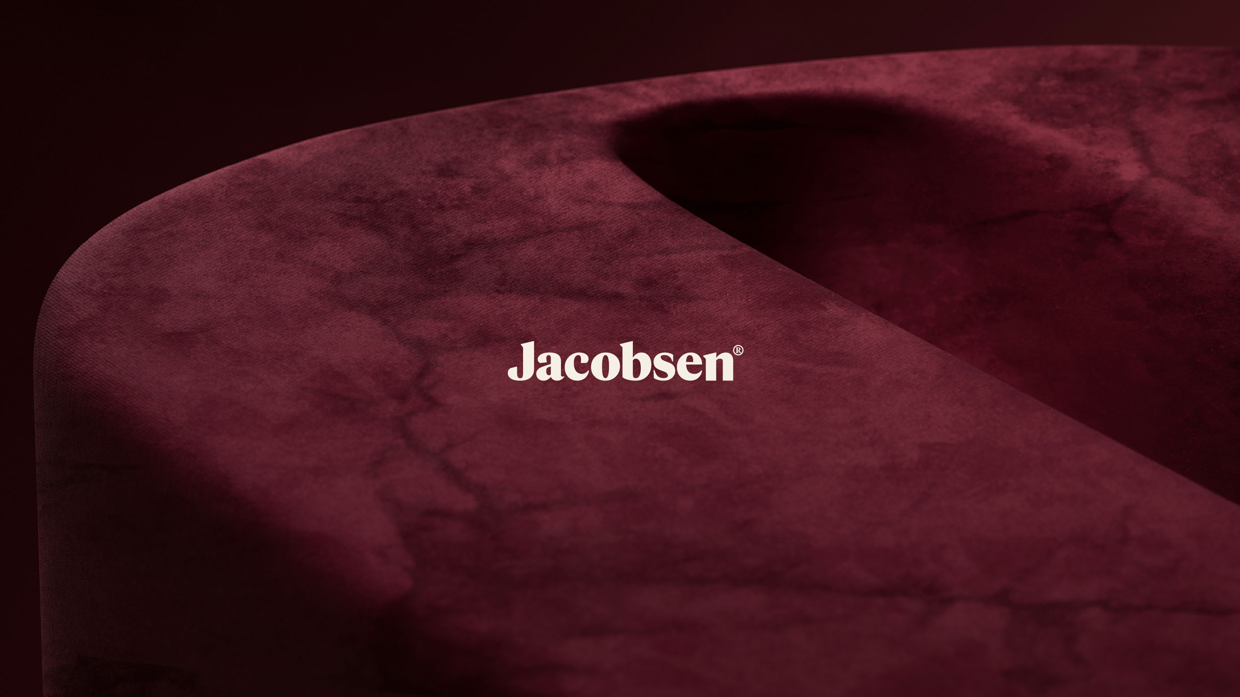
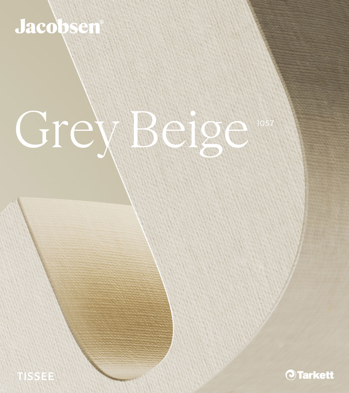
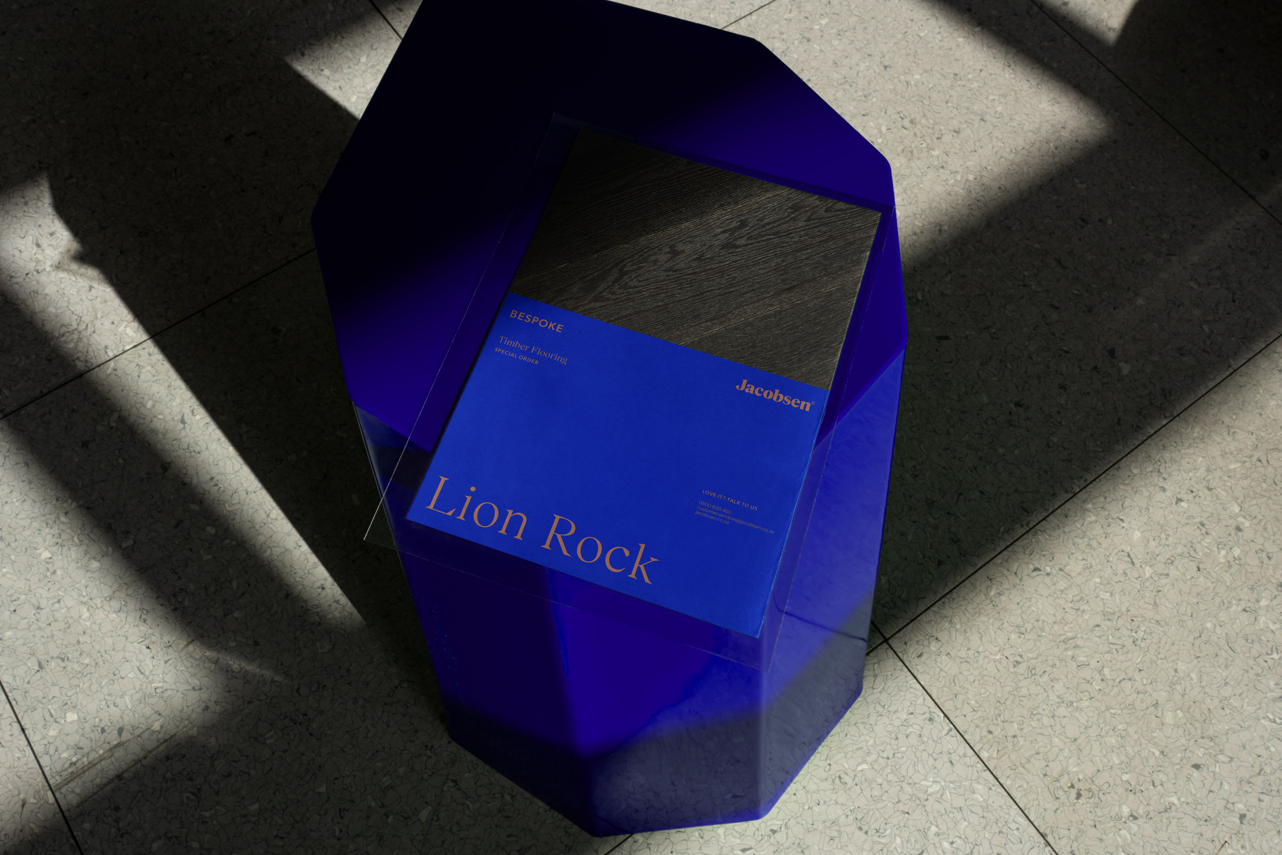
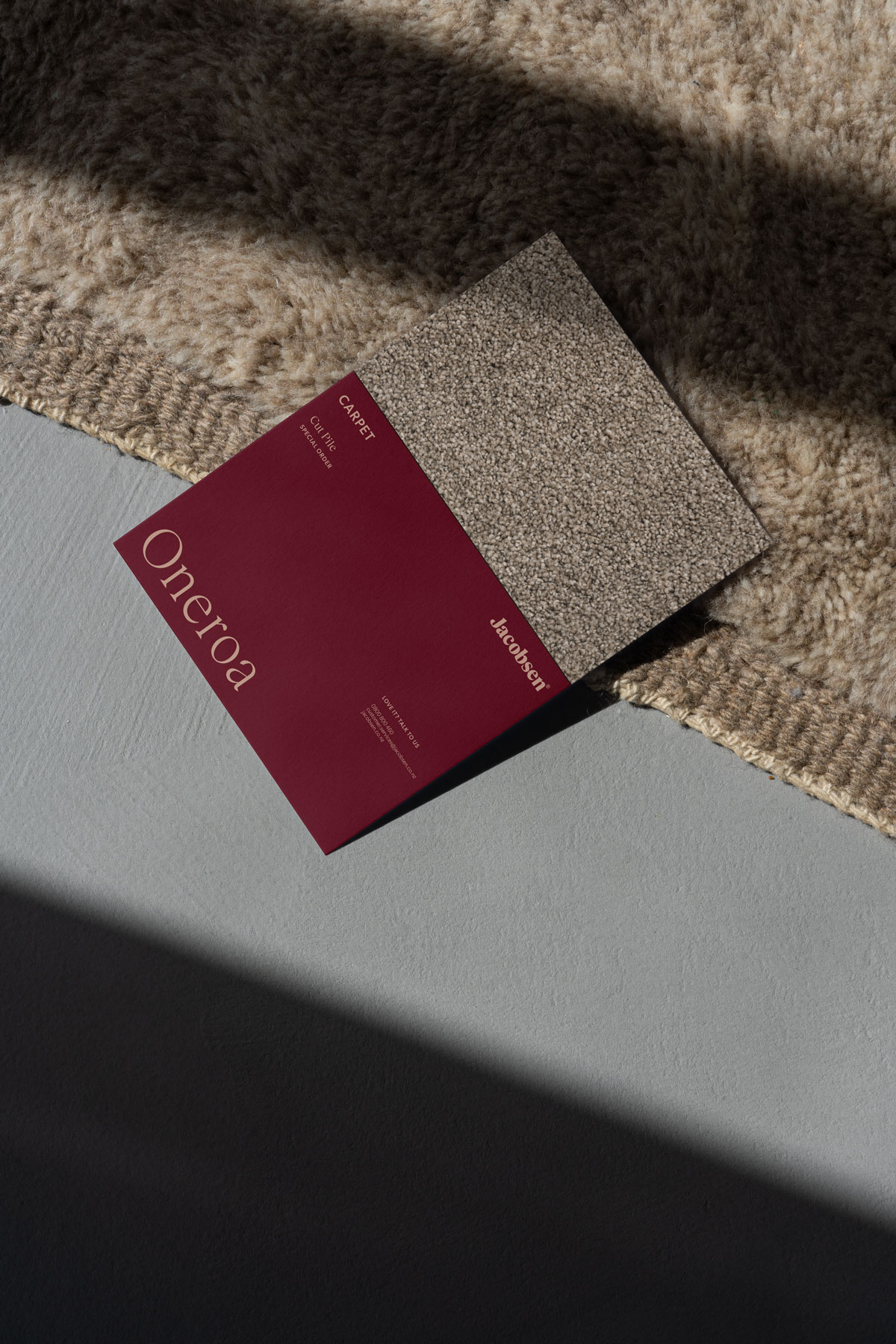
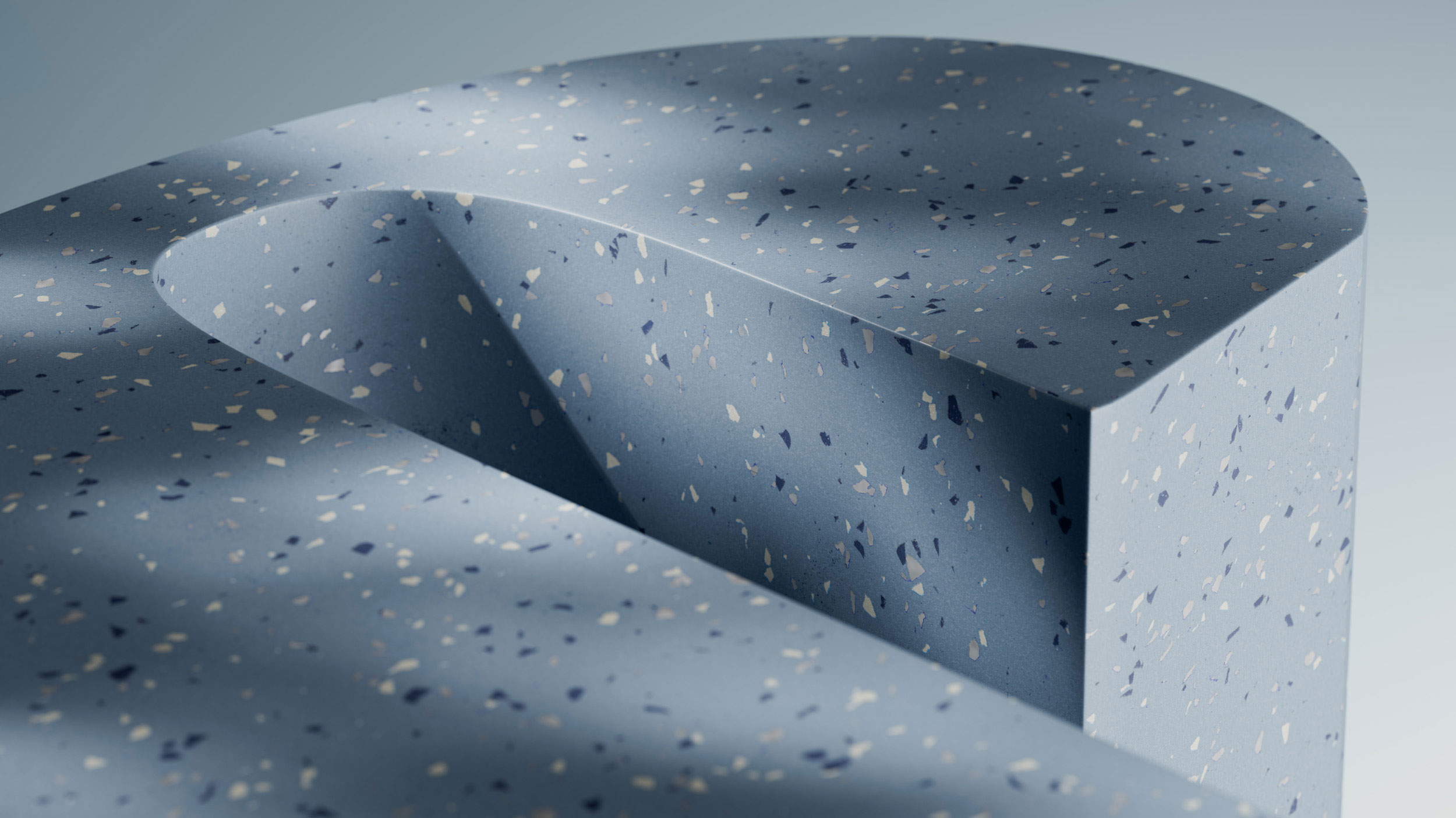
Through an outsider’s lens, we identified the ‘J’ as Jacobsen’s most powerful yet underutilised asset. Although it was a key signifier, its application had become superficial. We reimagined the ‘J’ as the central driver of the identity system, transforming it into an ownable and expressive device that could shape and unify the entire visual language.
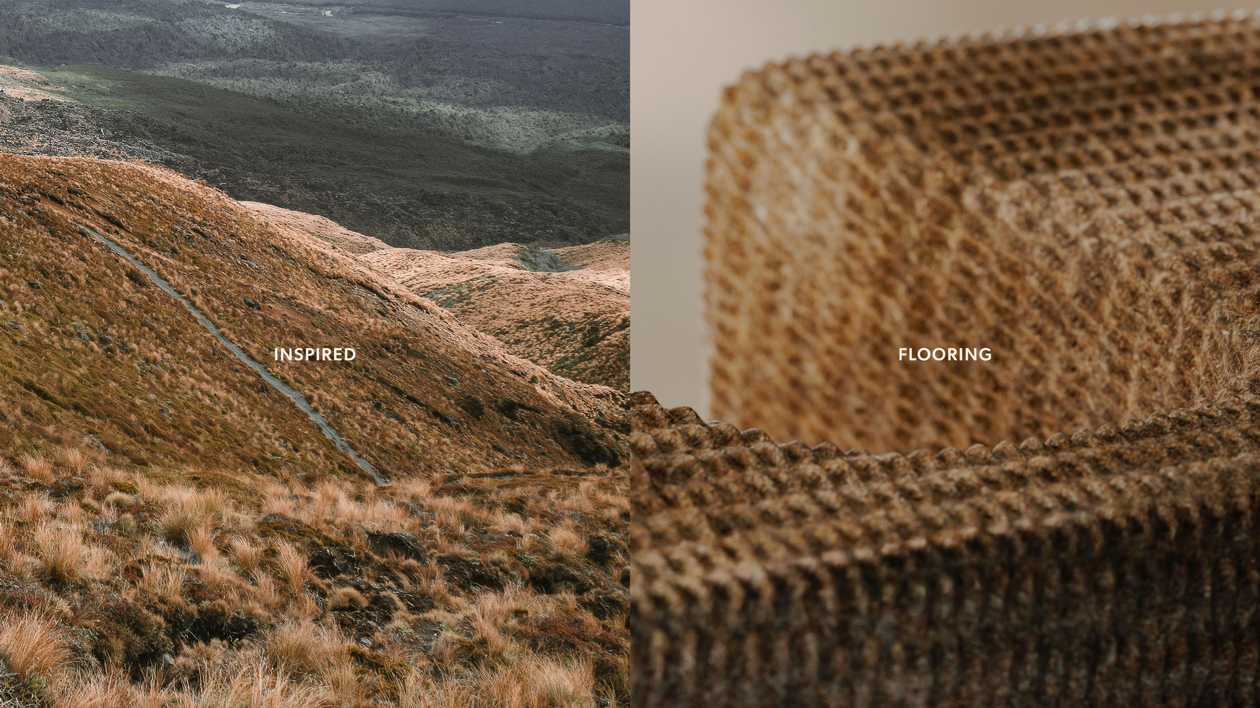
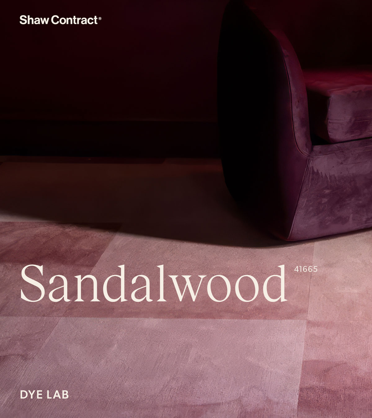
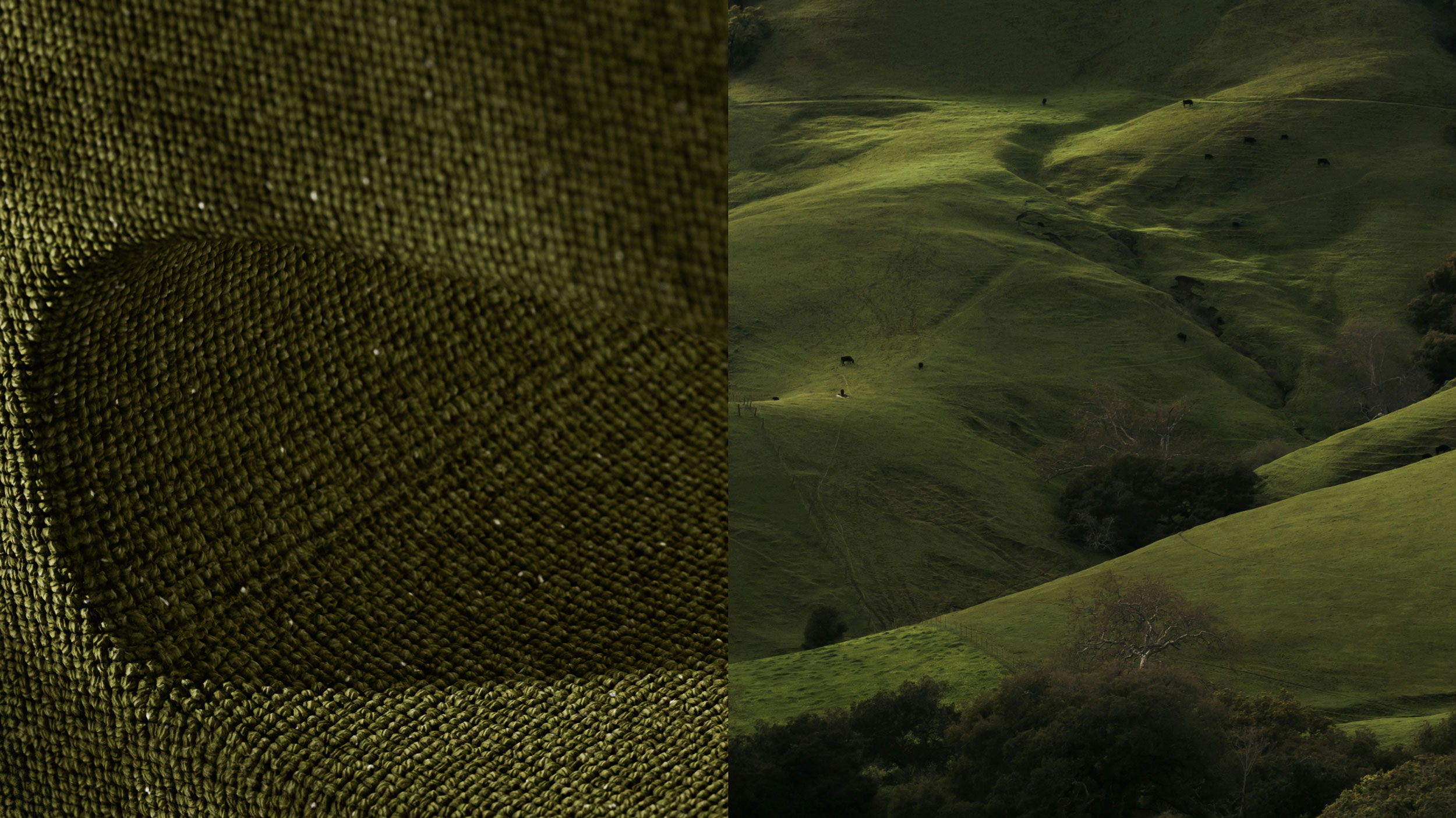
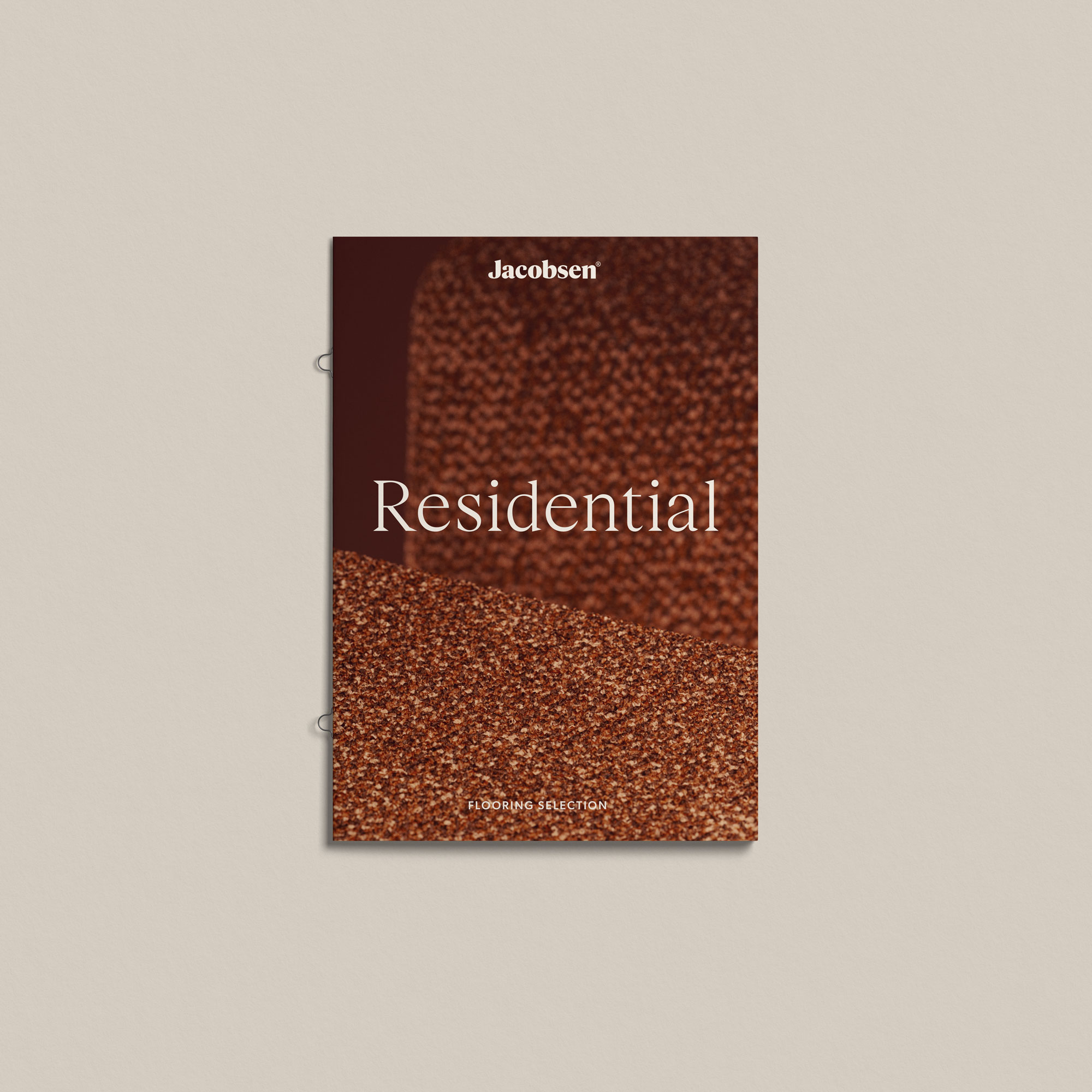
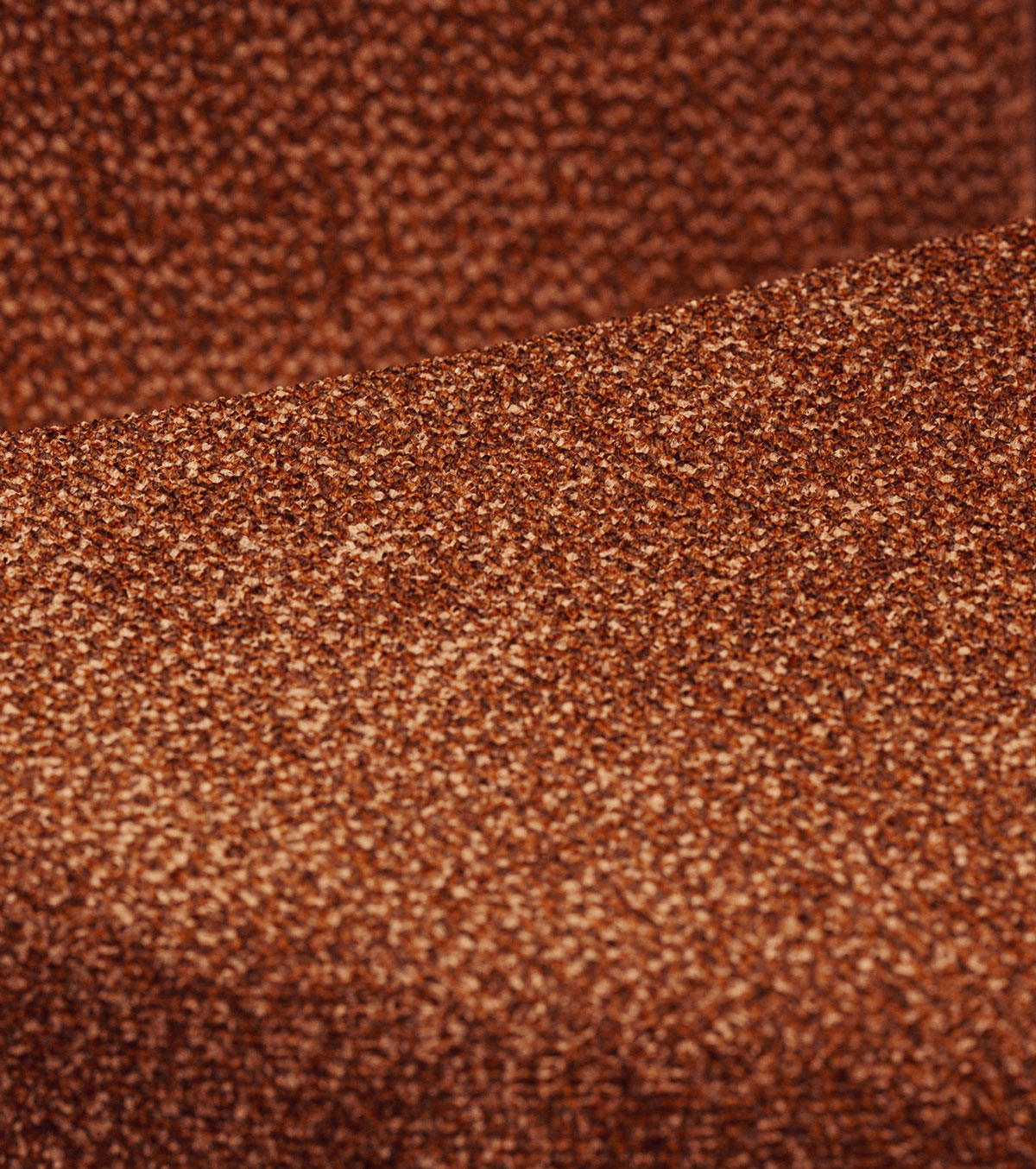
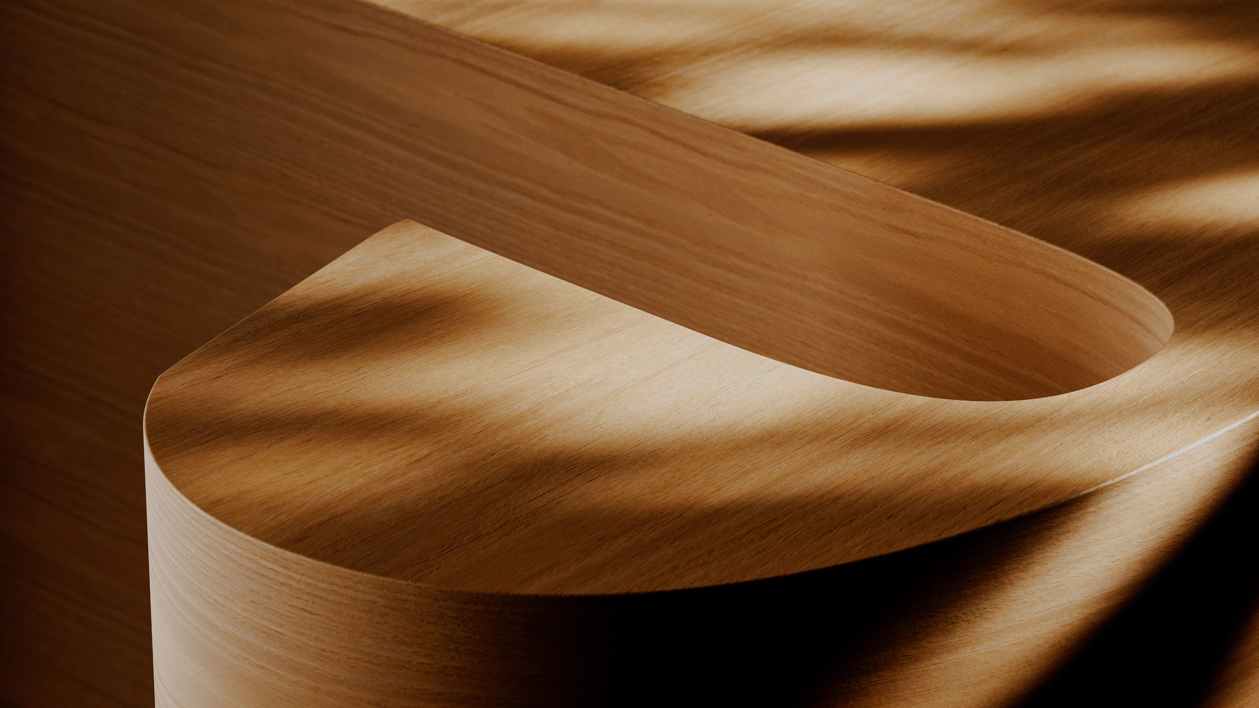
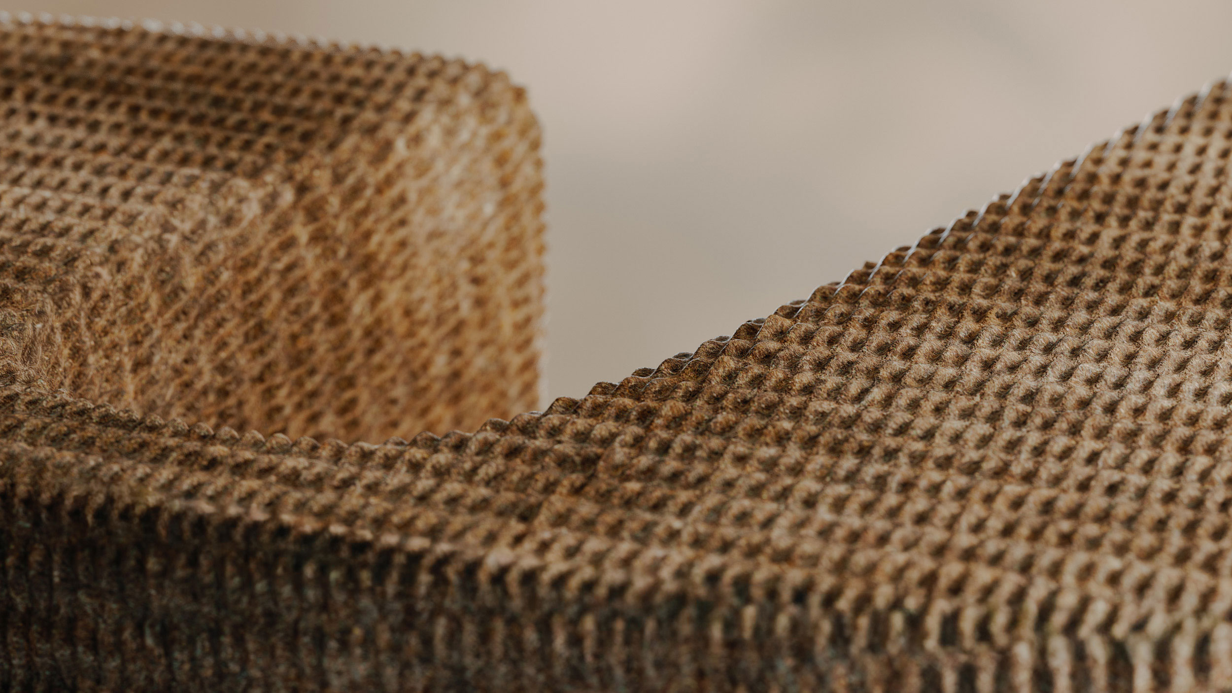
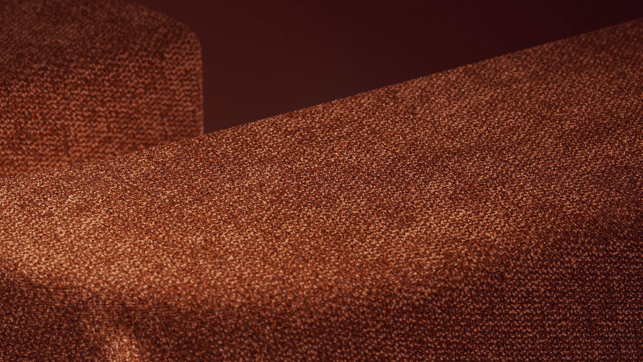
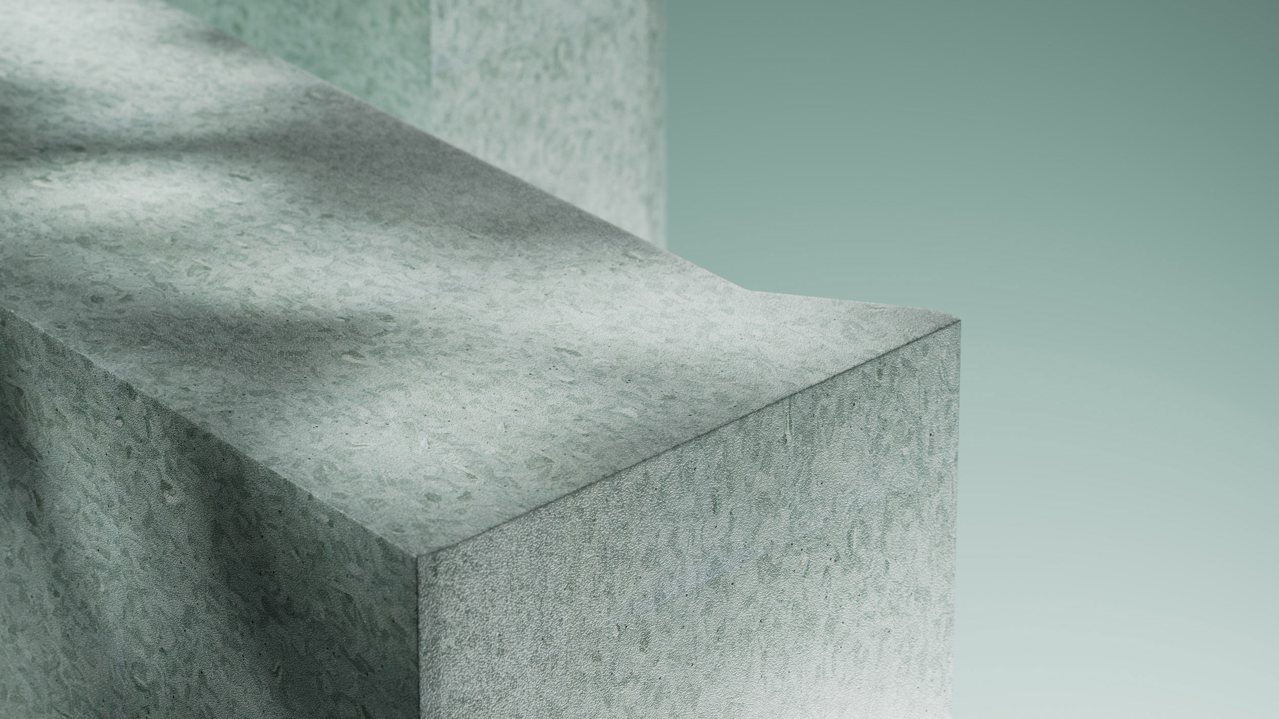
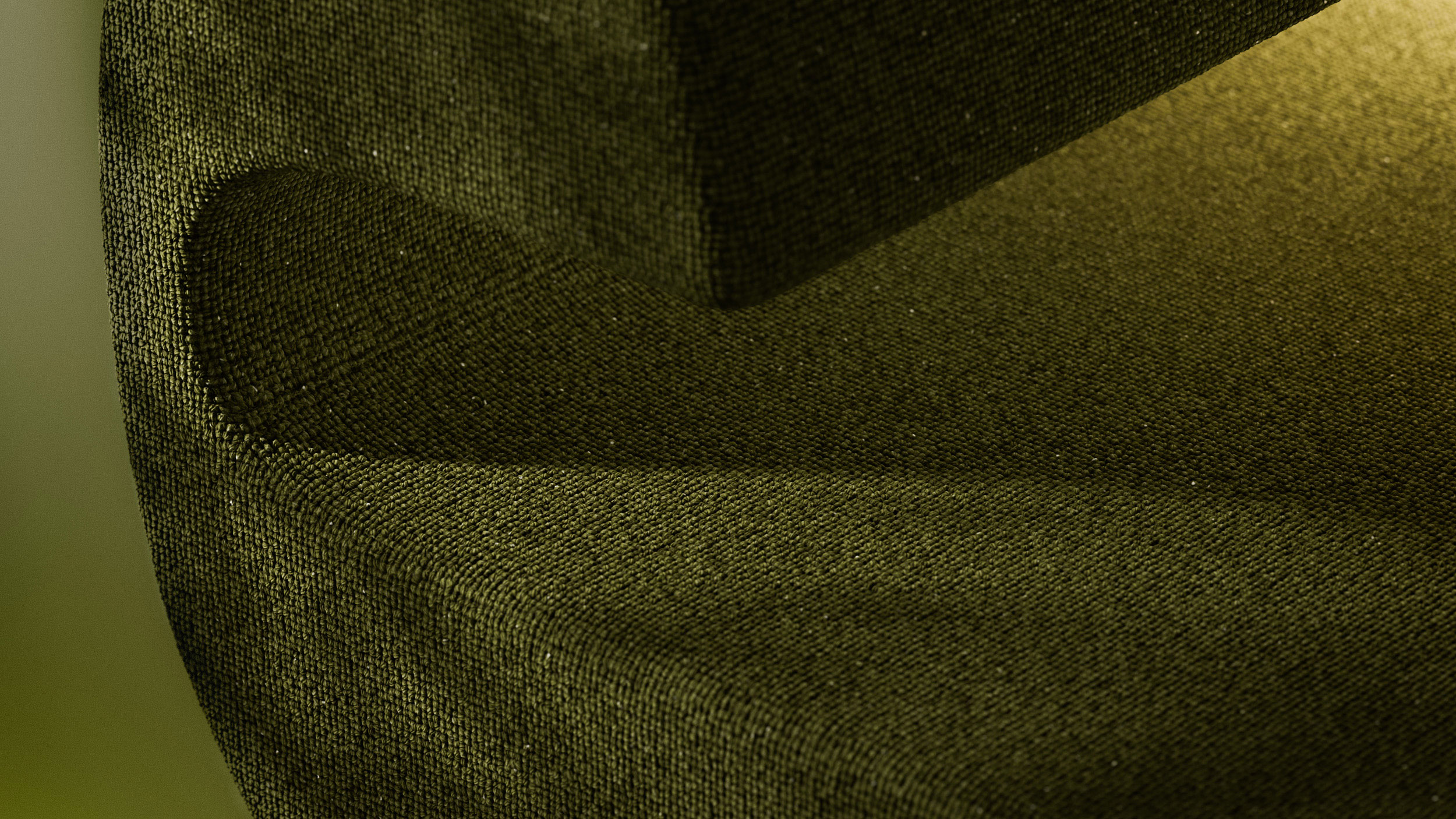
We also addressed the lack of ownership in the brand’s imagery. The previous reliance on familiar New Zealand landscape references made it difficult for Jacobsen to stand apart. This evolved into the “interior landscape” concept, where natural environments, product textures, and the ‘J’ merge into sculptural 3D worlds. The ‘J’ is ever present but never obvious, ensuring depth, intrigue, and longevity. Macro product photography reinforces this through rich texture and fine detail.
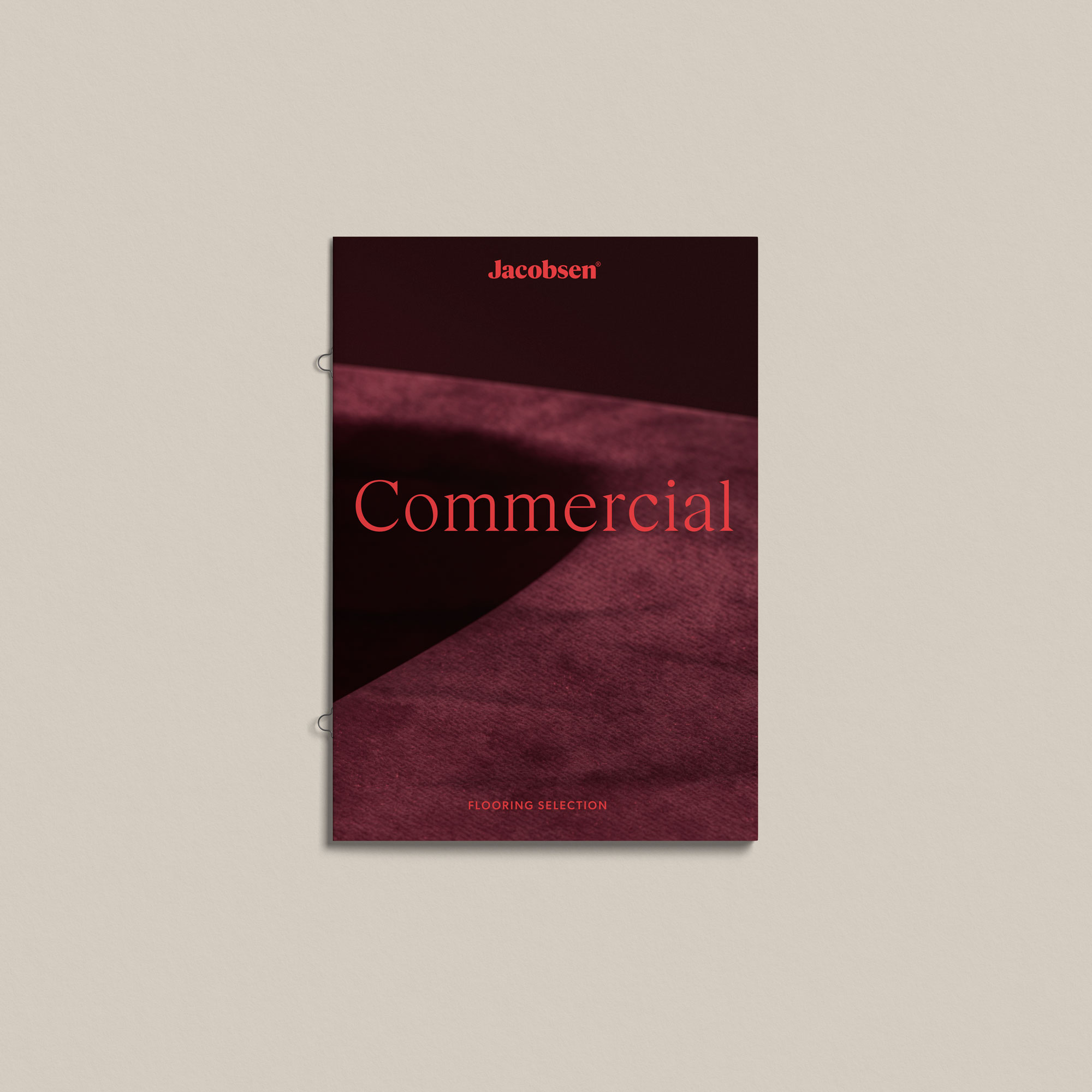
Revised brand typefaces and a flexible colour system allow the brand to better express itself through a more sophisticated lens, and evolve with trends while maintaining its core identity.
— 3D Visualisation by WorkGroup
Project
JACOBSEN
Client
JACOBSEN
Year
2025
What we did
- Brand Identity
- Design & Art Direction